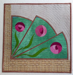
When Jinnie first posted "Windows" the first thought I had was to go and find a design from Coventry Cathedral as I wanted to do something modern, and after researching I cannot believe that I have never gone to Coventry to view this amazing building but decided that I didn't want to go the stained glass route as beautiful as it is. My journey then took me to look for modern windows and found this one below, which spoke to me.
I then decided to change the shape of the window and incorporate the
roses into the window. As can be seen from the original picture the window is looking from the inside to the outside and I have simplified the surrounds. I liked the idea of
the stairs at the side of the original picture as the straight lines
complimented the curve of the window but decided that it would make it
too fussy and might take away from the original subject. I then decided to change the shape of the window and incorporate the
roses into the window.


Fascinating, I love how your journey went from idea to idea. The final piece is a great example of simplifying an original photograph - wish I could do that.
ReplyDeleteI love following people's train of thoughts. Wonderful how you wove the two images together. I wouldn't mind a window seat like that. Your usual attention to detail and execution, Patricia. Hilary
ReplyDeleteI agree, great how you have merged the two styles. Interesting use of colours I don't associate with you and you have nailed it.
ReplyDeleteI too like the way you have merged both ideas.
ReplyDeleteHow clever of you to bring so many different elements from different windows styles together. You have made a great piece.
ReplyDeleteI can add no more to others’ comments - I can’t wait to see how you mix it up next time!
ReplyDeleteI love how you have transformed your two ideas into this piece. Beautifully done!
ReplyDeleteI agree with all the above comments and think how cleverly you transitioned your ideas to create this wonderful piece . The window shape is unusual in itself and lends itself to the creation of a different design . Your stitchwork is without flaw as usual .
ReplyDeleteBeautifully done Patricia! It is amazing how one idea can flow into another..... I really like the piece.
ReplyDelete