Pages

Thursday 3 December 2015

Profiled in Art Quilt Collector journal

I was thrilled to be chosen as an Artist to Watch for the new journal, "Art Quilt Collector", published by SAQA.  Issue 2, just released, includes a four-page spread on my work, and similar coverage of two artists whose work I very much enjoy: Natalya Aikens and K. Velis Turan.

The issue focuses on urban landscape, and includes an article on documenting your collection, another on storage, and an in-depth look at the recent work of Michael James, as well as other features. For information about subscribing to "Art Quilt Collector", please click here.

With SAQA's permission, I have included my profile below:


Wednesday 2 December 2015

Before all the dust has settled...


... just wanted to express my appreciation for everyone's efforts on the Apple Green challenge. I personally think it was our best showing ever!

My very best wishes to everyone for the holiday season, and for lots of creative energy in 2016!

Tuesday 1 December 2015

And the last colour is!!!


Yellow!  

After red, I think yellow is my next favourite colour, and of course almost any combination of the two.  I hope that it will make you happy - for those in the northern clime we could do with some cheering up as we have just gone through November.

I was going to put a Panetone colour but decided that any yellow will do.  Enjoy!

Monday 30 November 2015

Light reflections

I had this idea almost from the beginning and when I finally tried to take scissors to fabric it wasn't working for me.  So hence the last minute!

I saw light reflecting off a globe into a mirror at a friend's house and wanted to recreate the lines.  Of course, taking a picture didn't work.


Apple Green


Winter Crop

At this time of year the many fields surrounding Hudson have been harvested leaving only the bare stalks or shredded remnants behind for the birds. Outbuildings now reappear in brilliant colour and fall crops of mustard vibrate visibly against the  neutral earth tones of exposed soil.
Another  source of inspiration for this colour right now would be the surprising fresh green  moss found growing on the north side of rocks and trees when all the other colour in the forest has long gone awaiting a blanket of snow.

 For me it was an easy choice to  continue with my silk series based on abstracted fields and  bold colour  contrasts .Working with dupioni silk on the embellisher is a mesmerizing process as the bottom threads  emerge and blend before your eyes with the top layers to form a whole. Perhaps a little too many passes in this case has caused a  puckering through the middle which I hope will flatten out with a delicate steam iron. If not, it will have to serve as a textural effect.

Wishing you all an absolutely wonderful holiday with family and friends and looking forward to all good things in the new year.


Playtime


  This is definitely my favourite green and I almost chose it when it was my turn to choose a colour. I had bought a fabric paint in this colour, along with the darker green, just before it was announced and had been playing with it and my gelli plate, so I decided to try to make something from my printing session. I made a few small sketchs and chose this layout.  


Helena on Green

This was a two-for-one challenge. First, this is my most favourite of all greens and I just love to work with it. Thank you Heather! Second, I used the opportunity to create a self-portrait for our guild's self portrait challenge, due tomorrow. So perfect timing! This portrait is based on a photo taken at my daughter's wedding two years ago. My two daughters and their two babies (one each) are visiting at the moment, so I forgot to post until I checked my email. And now for your viewing pleasure, Oscar, age 11 months, who just happens to be wearing our green this morning.

Pop Art

Bridget Riley - Ra 2

Thank you Heather.  You gave me the opportunity to do something I have had in the back of my mind for ages - a piece paying homage to Bridget Riley.  I have long admired her work. There are some wonderful examples of her work if you google her name and then click on 'images'.  I have based my piece on the work she did after her trip to Egypt and seeing the wonderful colours in ancient Egyptian art.

Here's my piece.
Bridget Riley - Homage
I hummed and aahed about whether to try and piece or to fuse the strips. In the end I pieced them and it work relatively easily because I heavily starched the strips first.  This made them firm and they handled well.  I used the left edge of my 1/4" foot lined up against the previous seam.

Proportionately speaking the strips should be much narrower but I am happy with the first attempt.  I haven't quilted it because I don't think in this case quilting would add anything to the piece or improve it.

All in all I have thoroughly enjoyed this series based on colours.  One more to go.

Hilary


WHERE DID SPRING GO?
 
 
I love this colour and use it often in a lot of my pieces but as mentioned in one of my posts when using it against the blue / green it changed colour and looks more yellow than apple/lime green.  I too doodled and came up with this which is really just a design that evolved.  I named it as above as we seemed to go from winter one day to summer the next and there was no "inbetween" season.  With all this, we are now going through a terrible drought, so what was green is now slowly turning brown!  Thanks you - a great colour to work with.


DOODLING


I found this colour very difficult to give me something different to work with other than foliage or similar so I decided to do some 'doodling' on top of a whole cloth of a slightly cleaner version of the colour (I thought the black may have played more of a part than it did).  I doodled / stitched/ painted & bound.  Sorry Hilary I could not resist using my dot easy tool ! A bit of fun.

St.-Paul-de-Vence

In late September I spent ten days in the south of France. We rented an apartment in Nice and used public transit to get around the area, as far as Antibes to the west and Monaco to the east. I had a wonderful time, visiting many art museums, exploring markets and walking by the sea.

St.-Paul-de-Vence
One of the highlights of the trip was the ancient hilltop town of St.-Paul-de-Vence, the most frequently visited town in France. It is filled with art galleries, as you can see from the original photo on which I based my piece.


Having chosen this "apple green", I have been seeing it everywhere. The last time I met with Helena she was wearing a scarf of that colour.

Corner Art

The thread-painted butterfly is an experiment with "corner art". The idea is to mount only the butterfly and not the quilted background piece. The thread painting was done on water soluble stabilizer and the wings have wire couched on the back to give shaped. The piece is far more successful as shown, it looks rather wimpy mounted in the corner on its own. However, I think 'corner art' has potential and I hope to pursue the idea in the future.

Sphere

I had, of course, left any thoughts about this challenge until the last minute.  However, I have been thinking around this idea of spheres composed of bands of flying geese for a while, as a possible element of a larger quilt for a different competition.  This seemed an ideal opportunity to try out the idea and see what it looked like.  On the whole I really like it, and it has helped clarify my ideas for the composition of the larger quilt.

I found I had a perfect green in my collection of hand dyed fabrics, one from a range dyed graduating from deep purple to yellow.  I've used another form the range as the background.  Love this colour, even though it never would be described as 'puce' in my dictionary.  I also used a commercial fabric that also seemed to fit well.

Green, with a touch of surprise

This piece put itself ogether of it's own accord as one 'What if?' followed another. Even the colour of the quiltlines, which was going to be white, was determined by the serendipitous use of a blue marker pen - I loved the zing so decided to find a thread in a similar colour.
I enjoyed this one, thanks Heather!


Tuesday 24 November 2015

FINISHED BUZZ ART PIECES


These are the completed Buzz Art Blocks. No fabric. Just paint/ mouldingpaste & lutradur. I repainted each block its main colour and then sprayed thru lace curtaining.  I used bird templates made from 4 layers of freezer paper ironed together and filled with moulding paste.  The flowers are painted lutradur and are nailed on. Behind the flowers I did fray out some string to give a vine effect and the nails in the flowers are covered with painted felt 'pebbles'.  Not very original but thought I would stick with what I new for my first attempt and am fairly happy.  As you go along you work out what you should or could have done different .... but that is part of the learning curve.

p.s. my challenge is finished as well!

Thursday 19 November 2015

Shock and amazement...

... I'm finished and it's days away from the deadline. When Heather posted her challenge colour my immediate response was 'I don't do green!' but looking back on my pieces for
12 By the Dozen it seems that I do, in small quantities:


Tuesday 20 October 2015

Buzz Art Blocks


The blocks are 12 inch square and made of strips of plywood glued together, approx half inch in thickness. Very solid and quite weighty. This is because some may use mosaics or similar mediums.  This means that I will probably work on fabric and stretch it across like an artists canvas.  Still umming and aahing!!  


Wednesday 14 October 2015

CHALLENGE REQUEST

During our National Quilt Festival which was held in July this year we had an incident and one of the husbands of one of our quilters went beyond the call of duty to assist. With this in mind the committee wanted to recognise and show appreciation for this act and asked that I make a 'Quilters Star' award.  I was asked to use a 4" square artists canvas and I had carte blanche!  Being caught in the moment I said yes!   

After much mulling around and going no where, I decided to work on two and they could take it from there.  They also were under no obligation to accept either.

These are the results.....

Ultimately I had great fun and have been inspired to do a small series (different theme) working on a slightly larger artists canvas. 4" is really very small but quirky.

Needless to say I have not started, however, I have just received an open request from one of our local galleries calling for 'local artists' to take part in their annual 'Buzz Art' exhibition.  You buy a canvas (or 2 or more) from them for a nominal fee, use any medium to create your piece of art and it goes on show and you may put it up for purchase if interested.

Closing date 17th November ...... so watch this space!

Saturday 10 October 2015

Renovated Marsala piece!


I have finally got round to adding more leaves to flow across the binding so it looks more natural.  I see I have left some marking lines on a couple of leaves which I will remove. Much happier now!

Saturday 26 September 2015

Happy Day

I am pleased to have sold this needle felted silkwork from the series seen below to one of my gardening clients, who is a retired prof from the art department of Concordia University in Montreal. It was very rewarding for me to see it hanging in her front hallway where she said that its placement was to compliment the colours of the Jack Bush on her landing (a print) and a small  Edouard Munch on the opposite wall. I was very tickled that she was so happy with her purchase and that she was so generous in her encouragement. Big smile all day!
Thanks also to Heather for taking this photo and for the offer to hang the series this summer at our local medical center where she curates a gallery for the pleasure of patients in the waiting room. It encouraged me to get them into some simple gold frames and to think in terms of a series.


Friday 25 September 2015

New improved marsala


   I have added copper markal paintstik between the quilted lines on the black and I think it looks much better and far more cohesive, though there is still too much black. When I first made it, I tried to get around the problem of the piece of printed fabric being to small by photocopying it, cutting the copies in various ways and placing it on black paper to see what it would look like, but I could not find a way to do it without the quilt being smaller than it had to be. However it was a first try with my stencil and I am not  intending to leave it there and will definitely play around with it more. Up to now I have a small stash of fabrics that I have printed, plus some samples and several small pieces like this, but I think I need to start working on a larger scale to be able to make anything of it. In case you have not seen it the site http://www.culture.gouv.fr/fr/arcnat/megalithes/index.html gives a good brief introduction and has some lovely photos. I tried to give the link to the English page on Gavrinis, but it would not let me, so just change the language to English at the bottom of the page, and look at the page 'Megalisme in Morbihan' to find the information about Gavrinis. The other sites are fascinating too. I first became interested in the carvings twenty years ago when we were on holiday in the area, having seen photos of them. However I didn't get to see the real thing until three years ago, when we went on a trip to the island. The carvings were fantastic, but I was a little disappointed as we only got see them by the light of a single torch, so they weren't quite as amazing as they appear in the photos when they are so well lit!

Monday 21 September 2015

Bye for now - Pamela

Pamela has decided to take a sabbatical from the group - for now.  Her life is rich and full but these last few months have left little room for making her little pieces in the various challenges.  She has been a member since the beginning when several of us met in our hotel rooms in Houston and the kernel of the idea was muted.

Thank you, Pamela, for your contributions.  You have shared so much with us over the years.  Enjoy your family and your various celebrations and we look forward to welcoming you back some time.

Stay well, stay in touch and stay creative,

Hilary

Monday 7 September 2015

Marsala and me ...

I'm sorry for the late arrival. I cannot explain my decision to stitch this so intensively, there was no artistic motive it was just a one of those thoughts that came from nowhere. The glass rings are paint - I'm a lot more careful with my wine than this!
Hilary, our PC died this morning so the photo is an iPad shot - I'll mail you a better image once our PC has been to see his doctor.

Now I can go and see what everyone else has done, I've been holding off as my reward for finishing.


Tuesday 1 September 2015

And the next challenge is...

... "Apple Green".


Actually, if you mix 50 parts warm yellow with 1 part black, you get something like this colour, which I have always found intriguing. Some of you may call this "puce green" but that's just opening up another can of mashed peas.

Monday 31 August 2015

Marsala


   I thought I was on to a winner when this colour was announced, as one of the fabric paints (red ochre)  that I have been using seemed to be a good match and I wanted to use some of the imagery that I have been playing with. I made some stencils of the negative shapes of the Gavrinis prints that I had done and played around with them, but it wasn't very successful as the paint wicked into the fabric and made a bit of a mess. I overprinted with copper paint and managed to salvage enough, with the addition of some black fabric. However the black stripes are too wide and it just doesn't look right. I might try using some markal to fill in the quilted shapes on the black to make it a bit more cohesive, but on the whole I'm not very pleased with it and if I'd had the time I would have started all over again!

Dot maker tool


These are the little dot makers.  The trade name is 'Dot Easy' by W & M but that doesn't bring up anything on google.

Hilary

Marsala accents

 
Fields of Gold Series #4
 
This colour was quite challenging and I did produce a few pieces using it as a dominant colour but was never really happy with the result not having any lighter variations in my stash of silk. Therefore I will choose one that benefitted from this colour using a predominant opposite. Cheating I know! I look forward to seeing how those of you who do gradation dyeing found this much easier to resolve.
Materials include silk and cotton and technique is needlefelting. 
 

Story Line

After all the fun Phillida and I had creating cloth which we both thought was remotely close to the inspiration source she had chosen, I have finished up almost obliterating the fabric/colour!  I love the colour and have two more pieces which I hope to use in the future.

But of the three ideas that came late into my head this one was shouting the loudest.  Many years ago I took a class at Birmingham with a lovely tutor, Sarah Fincken, about creating a story quilt.  It was called Track Mapping.  I enjoyed the class and have a design worked out for a large quilt.  I guess this has always been in the back of my mind and the colour rekindled the idea.

Well, the quilt was started on Saturday afternoon and finished just before lunch today - talk about taking it to the wire!  There is raw edge machine appliqué, hand and machine stitching and a lot of paint.  Phil, I haven't a clue who the kind lady at Kearsney was who gave me the dot-making tool, but she saw it for sale on the Guild stand and thought of me.  It is magic!


There are painted women dancing around a camp fire with smoke, dreaming tracks, kangaroo tracks, clouds with rain falling on a waterhole and the sun.

What fun.  I am also aware that there is a school of thought that thinks using aboriginal icons by non-natives is bordering on the offensive.  I hope I haven't offended anyone or trodden on any toes.  

Hilary

Merlot

I had "Merlot" in my head instead of Marsala, but here it is. I have to say I struggled with this colour, it did not ring my bell the way pure red does. Can't say much more about this!

Spinning

I certainly had trouble coming up with the colour.  But it was a fun exercise and I have a few pieces that are a bit smaller than our A4 size that I will quilt up.


This piece is actually smaller that the one above.  It wasn't quite the right colour but it called out to be quilted.

These are some of the pieces of fabric produced by dyeing, dye painting, painting and stamping with textile paints.


MARSALA FLOWER POT


After playing around so much with the dyeing and thinking we had it as good as it could get the  moment you start joining it all together they start changing as they bounce off each other. Needless to say the pot and the right background were the two Hilary & I thought were as near as dammit.

On pondering what my piece was going to be I suddenly realised how much of the colour or  similar hues I have around my garden and they all have the lime green as well. I went with one of my terracotta / Marsala ?? pots I have around the garden.  The intention was to have the leaves hanging off the border but in my rush I quilted them down hence they have been chopped off.  I think I will go back and add possibly 3 'loose' leaves that will sort that out. I also realised afterwards I had cut the green shibori fabric on the left binding the wrong way. That is staying.

Here are a couple of the other 'things' I have around me in the garden along with, can you believe it, a ball of wool, almost in the correct colour, that was in my goodie bag from our Festival.


Marsala: Water Tower #9

Water Tower #9

My response to the challenge has 9 or 10 other colours in it apart from the Marsala wine-red, which I had on hand from a long-ago dyeing session. If I were to do it again, I would use a more mottled fabric for the sky to add interest.

The image is based on a photo taken by a friend who visited New York and, knowing of my fixation on water towers, shared the photo below. 


original photo, taken by a friend


SEA URCHIN

I have titled this Sea Urchin as the idea popped into my head that I could use this colour after drawing up a piece, which I may add this was done in the first couple of weeks (the drawing that is), but only started the piece last week!  I had my computer on with the colour on the screen and went through my stash and eventually decided to use a selection of fabric that all seemed to be the right colour, so used most of them.  After completing the piece I realised I could have quilted it differently but it was too late, so here it is.


The background colour on the piece does not reflect what it actually is very well  - it is a lovely aqua which sets off the marsala.

Planted Feathers

I was grasping for a direction so started by using the 3 in 1 colour tool by Joen Wolfrom. I collected all the fabric, buttons, trims and threads in my stash of the suggested colours on the 'marsala' colour card and started playing. After a friend asked me if it would be possible to make fabric feathers I pursued the 'planted' idea.

Marsala, or three pieces in a series of one!

Having disappointed myself with the last challenge, I wanted to do better this time.  As I was labouring under the mistaken belief that the pieces had to be done by the end of July I was ready early for once.

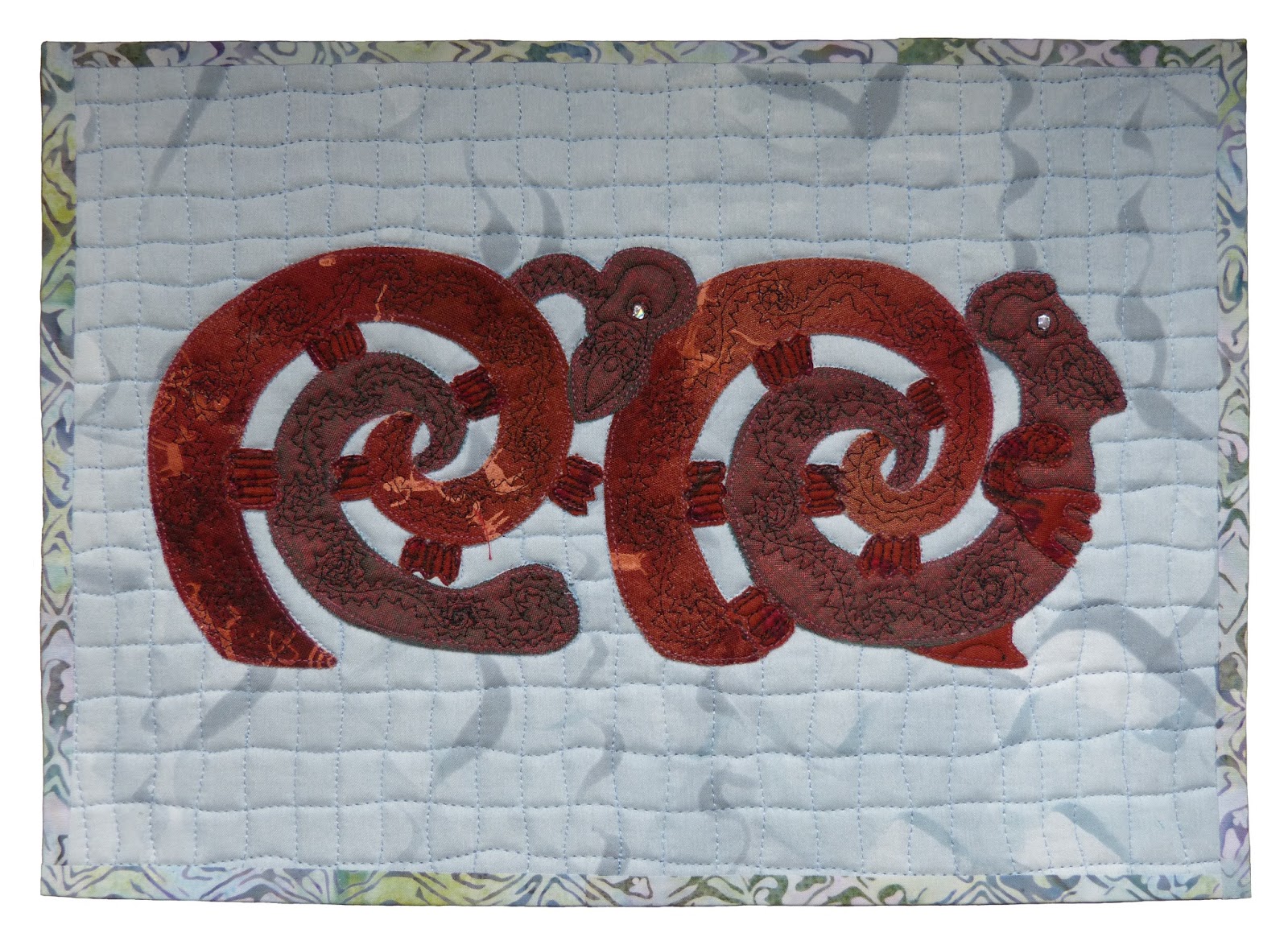
I wanted to use some of my experiences in New Zealand as a basis for the piece, and Maori carvings in a rich red, marsala, colour seemed to offer the best way forward.
 Here's my first attempt.  I wasn't too happy with the finished piece, so I tried again!
 This was much better, but I still wasn't sure about it.  Then I spent a happy two days working with Gloria Loughman, and decided to try an idea from that session.  I've used the same marsala coloured fabric, and still have New Zealand as the theme.
I was much happier with this.  The hills are meant to look like parched grass, with sheep tracks going round the hills, but they do seem to have ended up more like sand dunes (we saw those too).  Trying three times was a valuable lesson, and I find now I like both the latter two pieces.