I have been unsuccessful in posting comments individually on each persons work this time around
and hope the situation can be rectified at some point soon . Meantime I just wanted to say that I thought the group produced wonderfully diverse and interesting interpretations of Lurcat's work ,looking at what they were going to do from so many different angles . This is the fascinating part of being part of this group . Thanks to all for explanations of processes as well which gives insight into your final pieces. Much appreciated and something I haven't thought of doing . Rosemary

The group blog of four quiltmakers and textile artists scattered around the world in 4 countries and across three continents. Our aim is to create a small quilt every three months. The theme is chosen by the members in turn. Our website is: www.12bythedozen.weebly.com
Friday, 30 November 2018
Blown every which way
I was in two minds about choosing Lurçat as I knew he wouldn't be everyone's cup of tea, but I am so glad I did because the quilts I've seen so far are excellent.The exhibitions that I saw in Aubenas which included his work, and the one at the Manufacture des Gobelins in Paris, really impressed me: the scale of the work just took my breath away and the colours just glow. If I had not seen them in real life, I do not think I would have liked his work so much. I did not have any idea what I would do when I chose this artist, although I knew what it was about his art that I wanted to work with. I wasn't inspired by any tapestry in particular. I particularly like the leaves in his designs and the way their light edges glow against a black or dark background. So I knew I wanted a black background, but it took me a while to work out how I would do the leaves. In the end I made several lino print blocks of leaves and printed them on a yellow hand dyed fabric. I cut these so that a yellow edge to the leaves was visible and appliquéd them.

Circle Play
 |
| Circle Play |
Like some of the others I wasn't realy inspired by Jean Lurcat, but this often leads to surprising results, and having to stretch the imagination even more, and even if it takes much longer to get there. (Normally I try not to look at the other works, before I publish, but this time it happened by accident.)
 |
| Inspiration from Jean Lurcat |
Early on I decided to use only the colours from Lurcat, and not necessarily a palette I would normally use. Again to stretch the imagination.
 |
| Inspiration from TV show |
Watching a tv series, I found a print on a wall that took my fancy and that I could transfer to fabric. I made a pattern on paper by drawing some lines and circles, trying not to copy the original print.
 |
| Work in progress |
Using a palette generator: https://bighugelabs.com/colors.php I got my colours and started finding fabrics (mostly silk) from my stash. As my pattern had 24 bits, I chose 12 colours, giving me two patches of each colour and it was time to place them.
I cut the patches slightly smaller than the patterns, so the black fabric I would fuse them to would show through.
 |
| Before fusing |
 |
After fusing (colours looking funny in this pic.) |
I decided only to quilt around the edges of each paths, normally I like a lot of quilting, but I felt the for this quilt it would spoil it. I am very pleased with the result, and would never have arrived here without this group and it's challenges. Bring on the next one!
Well, I might actually have to skip the next one as we are moving back to England in the middle of february (East Anglia) - our house here in Guernsey has finally been sold after three long years on the market. That means we have lived here for 25 years this month.
SUN FISH
SUN FISH
I did enjoy this artist's work and had a lot of fun with my interpretation, also the colours are ones I do enjoy. I used quite a lot of metallic thread and gold cord and appliqued the design onto the black background. I thought the fish would be the easy part but after trying out four pieces of fabric I finally hit on the one I liked best, which I think worked well. The whole piece was a lot of trial and error and I finally realised that I could not use too many colours (I had originally started out with blue waves in the bottom right) and halfway through I took those out, replaced them, and used colours that blended rather than stood out. All in all I am happy with my piece. I scanned the top three images which I got my inspiration from and I apologise for the poor quality, but my printer didn't want to give me anything better.


WIPs: Münter and Lurcat
On the last reveal day I showed how far I had got with my Münter-interpretation and grandly announced I would finish within the next few days. But it has been lingering - probably not only because of important changes in my professional life that still requires adjustment processes to allow for enough time for stitching, but also because I am not terribly satisfied with how it has developed. I am not sure whether that is due to the fact that I like her work in all so much that it becomes very hard to distance myself from the inspiration and make the piece 'my own'.
For my taste, the outlines of the sleeping child in my current piece are not visible enough, and at present I don't have a really good idea how to change that without ruining it completely.

I have already added a layer of batting under the head that will make it 'pop' a bit when real quilting will begin. Just recently when I was pondering over it again I had the idea of enhancing the outlines by overstitching them with some lighter thread, or even a reflective thread I have. And handstitching some of the areas with a bit of running stitch to mark them. But it requires a bit more thinking. I will report when something develops.
For Lurcat I very quickly decided on the inspiration I would use, namely on the day the name was published. I chose the ceramic plate with a large sun from the 50s or 60s.

Right after chosing the inspiration I started a new job and have been working full time, which requires quite a bit of adjustment both on my side and my family, and the organization of stitching time has not been easy yet, so realization of the project did not start immediately.
When I began work, I traced a part of the design and transferred it onto bondaweb.

I liked the blue of the original piece and wanted to maintain that, but not the white. As the process of transferring from bondaweb results in a positive and a negative image I could choose two different colours for the 'background'. At first I did not know which I would use for the piece for the group, or perhaps make a double-sided piece.


Right now I think I will choose the piece with the orange background for the group, and the piece with the yellow background for a yellow quilt I am planning for the anniversary of the French Patchwork Organization. But I haven't finally decided yet.
In fact, as I am writing this, I have an idea about using some of the hand-stitched eyes from Guldusi's embroidery project and focus on the line of the four eyes, turn the segment and that way change the character of the piece entirely.


But this would not fit into the size requirements. So it wouldn't work for the group, it has to be put onto the back burner.
I am convinced that my adjustment to the new professional situation will be completed soon and stitching time will be more secure soon.
Scorpio
I was drawn to the tapestry designs of Jean Lucrat, in particular, the use of the signs of the zodiac, stars, sun & leaves. A good example would be this piece.

I chose my sign of the zodiac, Scorpio, and added all the other bits & pieces.

Whole cloth splattered with silver paint. The Scorpion was drawn & cut out from a whole piece and fused to the background cloth. The sun was stenciled thru a freezer paper template. The stars and leaves were added with the quilting finishing it off.
This one flowed really nicely and I enjoyed putting it together.


This one flowed really nicely and I enjoyed putting it together.
L'homme vert
What I am enjoying most about this series is discovering and learning about so many new artists. Thank you everyone.
I loved the graphic side of Lurcat's work. I would love to have experimented with a lino cut because I was so impressed by what the others had done before but time and circumstances were against me - this time. And then the idea of a notan-style interpretation popped into my head. Having drawn it out and ironed it onto fabric, I started cutting it out and immediately realised I had been crazy. It was so intricate and with so many fiddly shapes. I'm surprised I didn't mis-cut anything. It was when I was struggling with the second 'man' that I remembered a friend has a CriCut machine and I could have asked her to cut it for me. Too late, so this is all my hand work!

I had intended to put the cut-out on square but when I laid it out I liked it on point better. Had I known I could have made it bigger (and less fiddly!). Below are the pieces that inspired me.


Thanks Jinnie, Hilary
Thanks but no thanks ...
Thanks for the introduction to Jean Lurcat. I can see that his work is technically amazing but his subject matter and style have little appeal for me, but that's what this challenge is about, isn't it? In the end I narrowed down my choices to several pieces that featured fruit and leaves, though even his treatment of the veins on these leaves left me feeling uncomfortable ☺
I sort of worked with the left side of this piece in mind:

What appealed most is how the leaves filled the negative space around the central figure, a technique put to good use in Arts and Crafts tile design, so enter as influencers William De Morgan and Lewis F Day.
The central motif became a fruit, with thanks to Phil for her dotty tool which provided a bit of dimension and the rest just grew around it, thanks to some lovely tile designs. I've left more negative space than I'd originally intended but didn't actually notice this until the quilting was well under way.

I sort of worked with the left side of this piece in mind:

The central motif became a fruit, with thanks to Phil for her dotty tool which provided a bit of dimension and the rest just grew around it, thanks to some lovely tile designs. I've left more negative space than I'd originally intended but didn't actually notice this until the quilting was well under way.

Raw edge appliqué: 'Freedom' inspired by Jean Lurçat.
Turns out, this had been my favourite artist so far, so thank you Jinnie ☺
I certainly didn't think I would be saying that when I first say the work of Jean Lurçat. My first reaction was very lukewarm. He was yet another artist unknown to me and when I Googled his work the images I initially found were very mixed and somewhat confusing. As a result I put off thinking about this piece until quite late. However, when I did settle down to do some research I found I could not have been more wrong! I am now a great Jean Lurçat admirer,
Looking at the small thumbnails of his tapestry work really didn't help me appreciate his use of shape, line or colour - or the scale of his work. It was only when I found some high quality images that I began to see what Lurçat's work was all about.
Finding out about his life and what made him 'tick' also helped me understand why he made the work. I like the repetition of the motifs he used such as the French cockerel, celestial bodies and certain plants and animals. I particularly enjoyed finding images of him creating the drawings for his tapestries, a few of which I have added below. I can identify with his method of drawing on the wall!


 |
| 'Freedom' inspired by one of Jean Lurçat's pieces entitled ' Liberté' |
Turns out, this had been my favourite artist so far, so thank you Jinnie ☺
I certainly didn't think I would be saying that when I first say the work of Jean Lurçat. My first reaction was very lukewarm. He was yet another artist unknown to me and when I Googled his work the images I initially found were very mixed and somewhat confusing. As a result I put off thinking about this piece until quite late. However, when I did settle down to do some research I found I could not have been more wrong! I am now a great Jean Lurçat admirer,
Looking at the small thumbnails of his tapestry work really didn't help me appreciate his use of shape, line or colour - or the scale of his work. It was only when I found some high quality images that I began to see what Lurçat's work was all about.
Finding out about his life and what made him 'tick' also helped me understand why he made the work. I like the repetition of the motifs he used such as the French cockerel, celestial bodies and certain plants and animals. I particularly enjoyed finding images of him creating the drawings for his tapestries, a few of which I have added below. I can identify with his method of drawing on the wall!
 |
| Jean Lurçat at work |

As I looked more closely at his work I was amazed at how he was able to create that 'glow' around many of the motifs he used. I was even more surprised when I discovered that he used an incredibly limited palette of yellow, red, green, blue, grey, ochre—five shades of each colour except green (four) and yellow (six) so that there were exactly thirty tones, plus one black, one white. This makes just thirty-two in all!
So, for my work I decided to try and do the same and limit my palette of fabrics. I chose a few high quality images of various his pieces of work and analysed the colours he used and pulled out a colour palette.
 |
| An approximation of Jean Lurçat's colour palette |
I searched my stash of hand dyed fabrics that would be a rough approximate to use.
 |
| My fabrics |
By this time I had looked at a great number of pieces of his work and I particularly found myself drawn to his work about Freedom and Liberty - both themes that interest me and that I often use for my quilts. I decided to make my own 'version' of his piece called 'Liberte', inspired by his experiences during World War II and the famous poem by the French poet, Paul Eluard.

And here is my version again, created with raw edge appliqué, free motion embroidery and a little paint for the barbed wire.
 | |
|
Claire
x
Chloe a la Lurcat


My beautiful Chloe
Inspirations:
 |
| La Pichonniere by Jean Lurcat |
 |
| Tater Tot by Sophie Gamand |
JEAN LURCAT
This artist is different from the others which we have so far had, in that his body of work incorporated tapestries . I found these particularly intriguing and fascinating and couldn't decide which to do . In the end I did 2 interpretations but the first one shown will be the 'official' posting. Thanks Jinnie for selecting this artist for the series . I did enjoy looking at his art and especially enjoyed the making of my interpretations . Both included 'stand out' pieces (the flowers in the first piece and the wing feathers in the other . )This is a technique I learned years ago from Australian quilt artist ,Gloria Loughman, and I have used it in many quilts since. Rosemary
Lurcat's Tapestry My Interpretation


 The Second Choice!
 Poisson
Poisson
This has not been one of my favourite artists. That being said, when I
finally got around to doing my piece I had fun with it. I think his
designs are quite weird, and sometimes a little grotesque, but I get the
feeling that seeing the brilliance of the colour and the immensity of
his tapestries would give a whole different impression. And I would
certainly go to see his museum if I were anywhere near it.
The two of his pieces that I was influenced by were:

 Many years ago (maybe 15?) Hilary, Rosie and I decided to spend a day
doing one of the exercises in a book by Susan Carson and my fish was the
result. It has been hanging around my studio ever since. This was the
perfect use for it! I enjoyed doing the black spikey outline on it -
free motion zigzag - and I enjoyed using the colours that I did - a
little richer than I might usually put together. So thanks Jinnie for
the suggestion.
Many years ago (maybe 15?) Hilary, Rosie and I decided to spend a day
doing one of the exercises in a book by Susan Carson and my fish was the
result. It has been hanging around my studio ever since. This was the
perfect use for it! I enjoyed doing the black spikey outline on it -
free motion zigzag - and I enjoyed using the colours that I did - a
little richer than I might usually put together. So thanks Jinnie for
the suggestion.

The two of his pieces that I was influenced by were:


Jean Lurcat Challenge
Allison Moorcroft
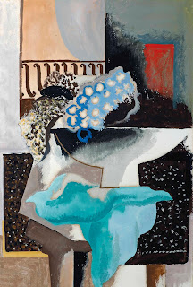

Abstract #1 Jean Lurcat


After selecting the “Nature Mort” picture from Google, I
sketched it for myself and then never looked at it again until I was finished
with my piece. I re-created the different elements and then put them together
into my picture. A cluster of buttons represent the dark grapes. When the water
was embroidered, I found a piece of blue hat–netting and so made use of it for
extra texture in that area. I tried to get a watercolour effect on the
‘vase’. Comparing the two pieces now, I
think mine is too ‘controlled’ and his is more dramatic and wild!
I can’t remember
ever having done an ‘abstract’ piece before so it was interesting to say the
least!
Subscribe to:
Posts (Atom)