Pages

Tuesday 31 May 2016

And our next artist is...

Pier Neef

I'm glad I waited until after the first reveal to make my decision of an artist because I wanted to see the kind of results that came in.  Klee used a wide variety of styles and techniques over his life time but many were abstract/abstracted.    

I wanted to introduce you to an artist most of you may not have come across and have chosen a very different painter - his style is pictorial, South African and distinctive.   I hope this provides enough of a challenge to inspire you all.  Good luck.  Reveal date:  31st August.

Hilary

At Sea

At Sea I was for a while as I had changed my idea of what to do and found it very hard to come up with something that I was happy with .  Why does Inspiration always ride on the coattails of Procrastination!! 

Before this started I didn't know much about Klee, but now I know his work better and more fully enjoy it's complexity.  So thank you for choosing him - it was a lot of fun to work with.

I came up with the idea of using Ad Parnassum and using a "sea" theme background fairly quickly.  One of my daughters was sailing across the Pacific (she works for Jubilee Sailing Trust which has 2 tall ships and is equipped to handle all sorts of disabilities) and was at sea for almost 3 months.  They landed at a few islands that were quite mountainous and so I had a sense that I wanted to put something about that in too.  Of course the sunrises and sunsets could be quite glorious. 


So this is what I finally finished (an hour ago!!) and I am reasonably pleased with it.  It helped when my husband recognised that these were jib sails.  The background squares are covered in dyed cheesecloth.  It was my way of replicating Klee's tiny grid. 

Coincidentally this also was a good piece (one of two) that I am using for my Elizabeth Barton masterclass whose theme for May was layers. 


Below was my first attempt - just thought I'd show you how I had moved on! 


Kwela Africa


PAUL KLEE

MY INTERPRETATION OF KLEE’S PAINTING:

‘FUGUE IN RED’ 1921


This painting of Paul Klee caught my attention and I kept going back to it so I guess this was the one I felt I wanted to put my own interpretation onto.  I liked the colours and the shapes but decided I wanted to put an African twist into my piece.  Klee loved music and painting in equal parts and was in fact an accomplished violinist and when creating a lot of his work he interpreted pieces of music into his work.  He is quoted as saying, that “It’s terrible to marry when you are wildly in love with someone else.  That’s the truth.  My mistress is and was music, and I embrace the goddess of the paintbrush, smelling of oil, who is also my wife.’

I have called my piece:


KWELA AFRICA

I wanted the shapes to dance, in homage to his love of music, and therefore have called this piece as above.  For those of you who don’t know what Kwela is I suggest you go onto Youtube and listen to some of Africa’s greatest musicians who play this and where this music originated, back in the day.  When listening to African music you can hear this theme running through some of their modern music even today.  In the shaded areas above the tiangles I used masking tape and oil paint sticks and I also used the paint sticks to give the 'shadows' on the left of the shapes.


Mystic Rose

I dithered for so long and changed my mind so often because much of his work can be expressed in textiles.  Too much choice.  In the end I have gone for a piece that has hints of several pieces.

Mystic Rose
I read that Klee added lots of mythological symbols and numbers to some of his paintings.  I kept the bird but because of the format I had to limit the number of other symbols.
Flower Myth, Paul Klee
My version has the four triangles pointing inwards that you see in Ad Parnassum. It also has the coloured dots which are outlined in black (I couldn't resist having some of the dots)..
Ad Parnassum, Paul Klee
The trees are influenced by the simple shapes in The Red Bridge.
Die Rote Bruecke, Paul Klee
I have thoroughly enjoyed this first challenge in the new series.  The background is a beautiful hand-dye from South Africa.  The tree shapes are fused.  The dots are acrylic paint.  The bird was machine embroidered (my experiment with a mono print failed!).  The rose is a thermofax I already had with a bit of touch-up paint.  Grey texture is also a thermofax.

Hilary

Riff on Senecio

Patchwork, pieced, made of hand-dyed cotton, 16" x 16"
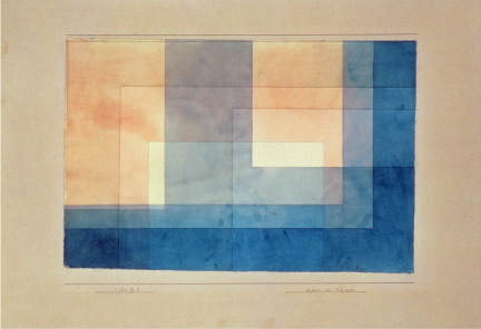
I chose the Klee painting Senecio as my starting point. I always assumed it represented a child, but then I learned that the title can be translated as "Old Man", from the Latin, "senescere", or "to grow old". Still, I find the colours suggest youth and light-heartedness. From this painting, I chose my palette, and I also used some of its simple curves and shapes.

Senecio, Paul Klee, oil paint on gauze, 1922

As the final assignment for the Jane Davies course Beyond the Colour Wheel, participants were asked to take the small, 3-colour collages we had made and "tile" them together. In other words, to take those 3" squares or rectangles and put them onto a grid, with no spaces between, just to see what they looked like arranged as a group. So my response to the 12 by the dozen challenge also met the criteria for the last assignment of my on-line course.

Many of Klee's paintings suggest a patchwork or a mosaic, with small square-ish shapes "tiled" to form a kind of loose grid, so my use of a grid is also a reference to Klee. I tried to use the colours in more or less the same proportion that Klee used them in Senecio.

In summary, I'd say that I like the original painting, I like the colours, I like the shapes, and I like the idea of a grid. But somehow the whole is less than the sum of its parts.  In fact it's a hot mess: Klee's image put through a blender. I think that without the organizational structure of a recognizable face, the piece has no unity. Klee's painting has a variety of small, medium and large shapes. My patchwork has only small and smaller. It's one thing to fulfill the requirements of a class assignment or a group challenge, but it's another thing to make good work.

Puppets on a string !

This certainly created a lot more thought & procrastination. Well done Patricia on choosing an artist who used many styles & techniques throughout his career.

Although I love colour and there were a number of pieces of work that jumped out at me I decided to go with his 'inventions' style.  The sketchy drawings and the sometimes quirky/ abstract nature of these pieces allowed me to use the mediums that I enjoy most - paint and thread.

In his paintings of this style, the themes or figures often only occupy a third or slightly more of the space with the rest carrying simple marks of some form.  This large open area frightened me a bit so I reversed the scale - my puppets occupy just more than half of the space. I was a lot more comfortable with this.


I brush dyed the fabric and then worked in thread and fabric oil pastels. No new techniques for me but ...... I have only put in 2 puppets.  Even numbers do my head in so I have stretched myself here.  Before quilting I nearly put in an outline of a third one in the background, but I resisted!!

Klee - House on the Water

There was no way I was just going to copy a painting, why would I do that? Why not just cut out a photo of the painting? Where was the creativity? What would I learn?  But in the end that's just what I did:


And here's the painting I (Almost!) copied

Paul Klee - House on the Water 1930

All the time that I was looking at Klee's faces that I intended to work from I kept coming back to this painting. Whilst I like the colour palette I find the use of light and dark quite disturbing, although the light areas create movement they also split the painting. I started to mask different areas of the painting to try to understand why it was having this effect on me and fell in love with the section that I re-created.
It isn't obvious from the photo's but the proportions of the selected area felt a bit 'off' when I used them on their own so I slightly changed the balance of light and dark.
Original this is not - and I apologise for that, but I love it and I did l learn quite a bit about balance and proportion too!

Klee goes Down UNder

My inspiration piece was Klee's 'Moonlight' piece, as I loved the colours and composition.


I was already working on a design based on the Sydney Opera house, and wondered how Klee might have depicted this had he ever had the chance to see it.  I used an embellisher to recreate the feel of crayons on paper, which was reasonably successful, but I wish I had allowed myself more time to work on the design.  I feel I could have improved the layout of the piece, rather than working in an improvisational way as I had chosen to do.


Klee

Cellular Love


To experiment with our first piece I decided to focus on edge and proportion using the concept of colour as a main subject and to reduce the shapes into softened geometrical forms. Klee was an expert at colour proportion to evoke an emotional response or mood in his work and this can be a fun concept to try just on its own with simple shapes to learn about colour and expression.

I like the edge development best in the smallest block in the left corner which reminds me of the treatment in Klee's Coming to Bloom 1914 where each colour has been filled in with soft edges onto a dark background giving the effect of a a chalk scribble that appears to be floating. I will use this again. I also like his muted oranges against the compliment of blue purple better than the bright orange against the purple.The photo here does makes it worse

The two posters on my wall at art school were Klee's " Fish Magic" with all the coloured shapes emerging from darkness and a bright Kandinsky abstract landscape, so free form in line and colour. I think the idea of colour as subject and symbols as abstraction were two eye opening  concepts for me which I vividly remember blowing my mind.  It will be nice to revisit the different artistic movements during our new series. We should be glad to never have had to live through someone like Hitler placing controls on our lives and creativity and having our work destroyed like these artists did.We surly can be very thankful for that.


Coming to Bloom
Paul Klee 1914

 Coming to bloom - Paul Klee

Wild Fire Devastation

Klee's use of black lines and the look of a hand-dyed fabric in 'Insula Dulcamara' was my inspiration. In May, Fort McMurray, Alberta was declared a 'state of emergency' after a wildfire destroyed their community. I have used hand painted fabric, bias tape and aqua bricks.
Good choice, Patricia as Paul Klee certainly has something to inspire everyone.


Kleeful - Inspired by "Architecture" 1923


I was inspired by the colours of Architecture (1923) and used them to create my own piece. The temptation with many of Klee's works, I found, was to reproduce them exactly as quilts. I tried to stay away from that. Kleeful is a textile collage on a felt background, covered with tulle and then heavily machine quilted. I ice-dyed many of the fabrics on vintage tablecloth and these fabrics came out amazing. Here are a few samples.


Monday 30 May 2016

Living in New Zealand probably means that I will be the first to post. So here goes .
I think that this series is going to be most interesting and certainly a challenge for me . Patricia's choice of Klee as our first artist was perfect as he had so much variety in his work . Like many of you I found it quite difficult to choose an example to interpret . However I finally decided on
   
   CAMEL IN A RHYTHMIC LANDSCAPE


                      The reason for this choice was because I liked the shapes and the colours . I realised that the 'lollipop' trees represented musical notes so decided that I would keep the linear format . The background was a challenge and so I simply painted it and then used a variety of variegated threads so that the brushstrokes were visible .
I didn't include the camel in the design but instead took the triangular shape of the ears and the spiky 'humps' and placed these randomly in the design . I also used these shapes in the stitching of the trees.
Klee seemed to like simplicity in this work which I tried to portray .
What fun it has all been . I called my piece 'Discord 'as I halved the trees and placed them differently from the placing in the original .


                     DISCORD

Women's Art Society of Montreal 2016

Here are some photos from this weekend's juried show. The new venue was the Grey Nuns' Residence Hall of Concordia University. Being an older building, it wasn't air-conditioned, but the light was very favourable. The venue provided all the easels, which made the "hanging" much easier for the installation team, as opposed to putting things on the wall and having to fuss with spacing.


A continuous slide show of all the entries was projected on a large screen at the back of the room.

Dianne's fabric collage (centre) took second place.
Heather's fabric collage (centre) got an honourable mention from the judges.
One of three large paintings by Cheryl Braganza

The past president, Cheryl Braganza, was able to attend the show on Sunday afternoon, despite struggling with a terminal and inoperable brain cancer. She was on a day pass from the palliative care unit at the Jewish General Hospital. She is much-loved and much-admired, an outspoken activist for social justice, dynamic and always positive. Members were delighted to see her at the show, and it seemed that she was thrilled to be there too.


DRUMROLL

THE PERSON WHOSE NAME CAME OUT OF THE HAT TO CHOOSE THE NEXT ARTIST

IS

HILARY GOODING


I am so looking forward to our next artist.  I have enjoyed this new theme and there have been times when I was constantly thinking of Klee and his works, and felt at times that he was taking over my whole thought process until I finally decided on what I was going to do.  I can't wait for tomorrow when we have our reveal.

Sunday 29 May 2016

Winter Tracks


I entered two pieces in the Women's Art Society of Montreal's show this weekend and this one won 2nd prize.  I am very chuffed, but also glad to have had a textile piece place as this is traditionally a painters organization and it's only in the last 5 or so years that textile art has been included.  There are four of us that enter work in that medium. 


Sunday 22 May 2016

It wasn't my intention to piece a Klee quilt but ....

Way back in March I decided that I wanted to focus on Klee's faces. I hadn't realised how many of his paintings featured faces and I love how he stylised his eyes.
Roll forward two months and the realisation that having done my initial sketches and a couple of failed sample pieces I'd not moved forward.  Except that I have - I'm now 'really into' (I wish someone could teach me art speak!) how spaces can be divided up by using blocks of colour to create interesting negative spaces, like this picture of a wall taken from https://www.instagram.com/graffitiremovals/

So I'm back to Klee's more quilt like pieces and have spent a fascinating evening selecting square areas of his work, or distorting rectangular sections that appeal. In the process I've learned that when he didn't follow the 'rules' relating to proportion he really knew what he was doing!

Saturday 21 May 2016

Seems like our idea wasn't as original as we thought ...


http://play.smilebox.com/SpreadMoreHappy/4e4451784e6a49784e6a673d0d0a 

http://play.smilebox.com/SpreadMoreHappy/4e4451784e6a49784e6a673d0d0a