Pages

Wednesday 28 February 2018

The Couple - A Sketch


My original thought had been to try to create a nude in his style, but after I saw the sketch (below) I could not get it out of my mind. I did the thread sketch in black thread on two shades on blue tulle to emulate the blue backgrounds he often used, along with a layer of orange tulle as a nod to the oranges often found in the still lifes.
Here is the original sketch.

Sammensætning

I couldn’t make my mind up on which painting to choose as my inspiration, when low and behold, I found my solution in a danish television program. I was watching a program about the daily life in an auction house and one expert was sent to a private home to value a modern painting. And, yes you guessed it; it was a Lundstrøm, never before seen by other than friends and family. It had been bought in the sixties, straight from Lundstrøm and arrived in the house with the paint still wet! That got me very excited and I hurried to take a screen print for reference - long live the iPad.

Inspiration

Background quilted
First I added layers of of textured bits, then I quilted the piece. 

Gesso applied
Then I added a layer of gesso with a heavy hand, and acrylic paint with a very light hand. 

Sammensætning

 The motives was fused and apliqued with black thread. I am very pleased with the result, it will not be the last time I use this technique, great fun!

Lundstrom meets Gascoigne

I really enjoyed being introduced to Vilhelm Lundstrøm. I love his flat colours and use of negative space, but once again I struggled with interpreting one of the images I liked in fabric. As I was looking through the catalogue of his work I came across his crate series. 


I didn't particularly like these pieces but they did put me in mind of the work of Australian artist Rosalie Gasgoine whose work I do like. 

The fabric was coloured as one piece. Serendipity created additional marks as I used an old quilt as a printing pad!  Once coloured I ripped the fabric into squares and bonded it to the background, additional marks, stenciled text and minimal stitch completed the piece.

text messages 16 - Lundstrøm by Uta

Thanks to Maj-Britt's suggestion I made acquaintance with another artist I had never heard about - but although I liked the pictures of his works I could find on the internet, again neither of them inspired me to use it as some kind of push-off for a quilt of mine. So for a while I was rather hesitant about what to do with this challenge, until I had an idea how to make a bit of graphic use of the special Danish letter
ø  included in his name.
 I repeated his name several times in a large script and also enlarged that special letter, overlaying the repetition of the name.


Then I chose a piece of fabric I had once treated to an attempt at shibori - realizing in that process that that is not my kind of technique, but that is an entirely other story - and started stitching.


That took a little while, but experience has taught me to be more generous with myself about the density of stitching needed before I consider the whole thing 'sufficiently' filled.  The letters of the name outside the graphic center were stitched only on the outline, within the graphic center I added a bit of a blue stitching line to mark the edge more precisely. 
Experience has also taught me that the most successful way to dissolve the stitching foil and the stabilizer beneath is to not only pour boiling water over it, but to boil the whole thing for a little while. Otherwise there will always be some residue left. 
Then I dry the piece on the heater - easy enought these days with the kind of temperatures we are having here right now! - and iron it flat.
Quilting around the edges of the graphic center. And this is it. I admit - not bound yet. But practically finished.


text messages 16

Portrait after Vilhelm Lundstrøm's 'Seated Nude'


For my first piece with you all I chickened out and played safe. Lots of my quilts represent people, and especially faces, so I was glad to find Lundstrøm  had several for me to think about. He is an artist that was previously unknown to me, so I enjoyed finding out  little about his work, so thanks Mai-Britt!

I chose 'Seated Nude' as it is very different from my usual style - so thought it would be good to really examine the shapes and colours he used to created his figure.

'Seated Nude' Vilhelm Lundstrøm (1940)


I focused just on her face. Using the computer I played about with the colour of a cropped image - to understand better how Lundstrøm had created a face from such simple shapes. It was very informative.


Using leftover hand dyed fabrics from many different different projects I was able to gather together enough of the right values and hues to create the 'original' face.I drew the colour block shapes onto plain paper to create a pattern, then transferred this to fusible web. 

For the quilting, I decided to simply follow the contours of the shapes. And this is how she turned out. 


I can't say I love it, but it was an interesting exercise and it made me think! 

I've decided to make these pieces into a collection in their on right and mount them onto stretcher bars - be interesting to see how it all develops. 

Claire


MY MUM

This artist really had me thinking.  I had already done a still life in the series so put that one aside.  This left me with his collages and portraits.  Initially the collages spoke to me and I even went as far as collecting possible bits & pieces but then I did a complete about turn and decided to go with the portraits.

Before I was born and possibly in my very early years my dad also did some painting of which we only have the actual works as memories. I remembered my brother had a painting that my dad did of my mum in their early years so asked him to send me a photo of it.


The colours are slightly wrong as he took it at night but it was sufficient.

I painted the background cloth and my mum is appliqued, dyed fabric.  As a consequence the whole piece was quite 'flat'.  I did not want to over quilt it but needed to give it some texture.  The proportion of my mum to the background is fractionally out (approx 1") but I can live with it. 


What is strange is that I never would normally work in pink tones and yet the previous challenge and this one have taken me down a different road. 


This was indeed an interesting challenge as I did not know anything about Vilhelm Lundstrom.  He has very definite compositional lines and he seemed to have enjoyed using cubism in a lot of his works.  I decided to be a little bit different and studied his compositions which were very definite and used this as a starting point.  Instead of using oranges and his jugs I decided to use a vase I had used in a previous work of mine and some funky flowers which I drew and changed into a cubist style.  It was fun and I do love the colours!


A Slice of Lundstrom


Well, this should have been a doddle.  His style appeals to me and it is not so dissimilar to that of one of my favourite artists, Morandi.  But I just couldn’t come up with anything more than a copy of one or two of his still-lifes – and that is not the point of our challenge which is to be inspired by an artist’s work.  So, it got pushed further and further back until the deadline was scarily close.
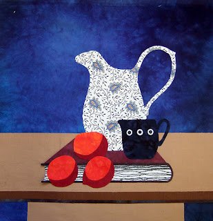
My still life
In the end I set up my own still-life in the style of Lundstrom with a ‘shocking’ plan in mind, something I have been tempted to do for a while.  This could be the solution to my problem: I would construct a still life and then slice it up!

Before being cut up
The first thing was to construct the piece, take a photo of it and print it out a few times.  I sliced a photo vertically into four sections and moved the segments around, some flipped.  It was terrible – maybe if I had sliced it into more segments and of varying widths…  Then I cut a photo into 16 (4” squares) – that left me with a lot of plain blue background squares. Nothing was gelling.  Next, I cut the photo into 9 squares - not a lot better. So I divided each square once diagonally.  Great, it was talking to me!  Now the problem was when to stop moving triangles around and trying out different compositions – every time I walked passed I couldn’t resist playing around.

Yesterday was crunch time and I had to make a decision as to which layout I was happiest with.  The triangles were bonded onto the felt batting and it was machine quilted using a variegated thread.  I guess if this was a competition/serious piece I would vary the thread colour so that the blue background stayed in the background (ie blue thread on blue fabric, etc).
Finished
It has been a fun experiment and I am quietly pleased with the result.  I feel I have fulfilled the brief – been inspired by his work but delivered something uniquely mine.

Thanks, Mai-Britt, and roll on the next challenge.

Hilary

LUNDSTROM
When I was confronted by this artist I knew that his serene and minimalistic style would need a different approach from my usual. So I chose to select shapes(jug and oranges)and convert them into an abstract design using colours that he liked to use. These are the pictures which were my inspiration:


I enjoyed working in this style -slightly Art Deco-ish and using non distracting quilting in the background and on the shapes . This is the final result:


Shades of grey

I wasn't quite sure what to do with Lundstøm's work.  I loved his colours, but found him very stylized.  So I thought I would work with one of his palettes - greys leading to almost white and he seemed very fond of oranges.  So here is a stylized log cabin with oranges.