Pages

Sunday 31 May 2020

New York

I was quite daunted when I started to look at the massive buildings built in the art deco style.  They looked so severe.  And as much as I loved the intricacy and beauty of the ornamentation I wasn't sure how I was going to make a piece that was "mine". 

I liked the moodiness of the entrance of the Chrysler building - as seen from inside.  And I did like many of the ornate grill works on doors of other buildings.  So the 2 pictures below are of the Chrysler building and the Downtown Athletic Club. 


 I'm not sure if you can see the detail of the quilting in this first photo so I've put in a bit more of a close up in the second.


Elevator door

I originally decide to look into my old photos of a picture from the Empire State building taken when we lived in New York back in 1983, but couldn't find anything worthwhile.  Next step was the internet and I found a picture of an elevator door which intrigued me.


I used photoshop to get the main outlines, and was initially disappointed that the process of converting a .jpg file to a vector file resulted in lots of rounded shapes rather than the straight lines I had envisioned.  On closer inspection I decided I liked this slight distortion of the image as I had set myself the challenge of not being overally exact in my interpretation this time (I have a tendency to be almost OCD when looking at images).

As we were in lockdown I felt as if I had lots of time to work on the image, and thought it would be nice to use a hand technique aka Dilys Fronk and her gates.  As it was the early stages of lockdown there was a preponderance of rainbow images everywhere (a tribute to the NHS) and I thought it would be nice to incorporate this to remember the time in which the work was made.  A quick hunt through my stash resulted in a piece of hand dyed silk velvet onto which I would hand appliqué the main design.  This lasted for less than a half inch of sewing before I decided to use Steam a Seam bonding for the appliqué!! (Frayed edges were everywhere.)

Here's the result!


The quilting is minimalist, just along the edges of the black shapes to hold them in place.

I am pleased with this piece, but I am also aware that it is in some ways a visual cliche.  However, as building work is still proceeding on our house (the reason I took a sabbatical) and time is at a premium as I am also working hard on the garden and doing all the internal decorating on the new extension, I decided not to try and revise the design.  I am still  undecided about whether or not to add extra quilting within the velvet areas, but at the moment it will remain as it is.

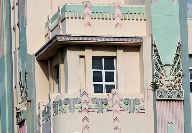
The Madison-Belmont Building Entrance


   My original source of inspiration was the iron and bronze framework to the entrance to the Madison-Belmont building.


   I isolated one of the motifs and made a lino block , which when put together would make a circular design, originally intending to use a big  and a small motif in a square design. However, I changed my mind and tried various other options, none of which fitted in either the square or rectangular formats.


   I printed the small motif on white fabric and quilted it, liking the effect. I also tried quilting it, so that  the lino print is on the back and you just see the quilting on three layers of a  shiny orangey organza, that is a similar colour to the copper paintstik. I also  tried it on a piece of silk, which I preferred. I thought that maybe I could use one of these on a background. I had hoped to use satin stitch to cover the edges, but not ever having done much satin stitch before, I tested it out on some scraps, but it was a disaster, so I abandoned that. I just stitched round the outer edge in a straight stitch, and I might hand stitch the silk one as it risks unravelling on the edge when I cut it.


    Finally I tried doing rubbings from the big lino block  using iridescent Paintstiks on black fabric, which I liked a lot, and decided to use as the background for a small quilted motif.


   My idea had been to place the motif on top of the background, but quite frankly it really does not work, though I like the two pieces separately. I'm not sure what on earth to do with it, though I think the small quilted motifs would make nice Christmas decorations!


Snapshot of Art Deco(ration)

Phew!  Made it.  I have just finished my piece.  I am relatively pleased with it.  There were moments when I wondered if I knew what I was doing with printing the images on the fabric.  I went through  quite a few extra sheets, not least because a couple had text on and I twice managed to print them back to front!  It's been a while since I used this process and in the meantime I have changed printer so finding my round the settings to up the saturation, etc, was a learning curve.

I was overwhelmed with wonderful images of buildings around the world.  I first thought I would be 'clever' and try and distil the essence of Art Deco in its lines and proportions and realised I am still struggling with being able to abstract things.  So this is my offering, a focus on some of the wonderful decoration on the buildings.

Snapshot of Art Deco(ration)
If I am feeling brave later I might go back in a write the names of the buildings under the photos.

The background is machine quilted in straight lines at angles to reference the angular aspect of Art Deco.  The photos have been printed on fabric, bonded to a second fabric layer to stabilize, and are held in place with leather corners.

Thank you for making me look again at Art Deco, Rosemary.  I am really an Art Nouveau person...

Hilary

NY Art Deco - Brooklyn Doorway


Thanks for a challenge that prompted some interesting research. In the end I chose these doors as my inspiration source:

Doorway in Brooklyn | Art deco door, Art deco buildings, Art deco

I've developed an interest in Welsh wholecloth quilts,  or more specifically, the way the patterns are generated.  I took the motif from one of the doors and used it in lieu of the leaf pattern used in Welsh quilts and used the door border, as is. The design loses something in this translation but i learned a lot from the exercise.

I transferred the design to an old cotton sheet, stitched it by machine then overpainted the whole with black acrylic. 


I like the fact that the paint application isn't totally even as it reflects the fact that this doorway fell into dis-repair when the building was unoccupied. 


I've struggled to photograph this, I think the contrast between light absorbing black paint and the reflective gold thread was too much for my aging iPhone, but it glows quite nicely in natural light!


A QUICK COMMENT TO AVOID CONFUSION !!


Just to put it out there the pieces of the Chrysler and GE Buildings are Rosemary's work and her comments.  Rosemary asked me to put them up on the blog on her behalf as she is not able to access her computer at the moment. 


ART DECO BUILDINGS NY CITY


To say first off that I really, really love Art Deco but on going over all that New York Art Deco buildings have to offer I became a bit overwhelmed by everything out there, so I took a while to work out how I really wanted to interpret/be inspired by this subject.  In the end I found two buildings, or parts thereof and wanted to combine them to form my final design.  The first one is the Channin Building in New York which has a frieze of Art Deco designs around the upper part of the building and the second one is a mural outside the Rockefeller Centre as below.


I wanted to use a grey background but unfortunately I had used most of what I had on another unrelated project so found a patterned fabric I must have had in my stash for at least 15 years  and used the back of that and bound it with the front of the fabric.  My piece is appliqued and the eagle is quilted in quite a lot of gold metallic thread but unfortunately can't be seen very well in the picture.  The block quilting behind the central design represents the tiles in the background of the mural.
PATRICIA


CHRYSLER BUILDING

In this piece, based on the Chrysler Building, I depicted the arched windows of the upper stories with a triangular pattern in them.  Lower down the building are the ordinary windows which are the green squares.  I also wanted to incorporate some typical Art Deco period designs such as the scrolls and simple leaf patterns.  The scrolls I divided up and used different fabrics with which to fill the shapes.  The central thin triangle represents the sky scrapers of NY city.


THE GE BUILDING


The lower picture shows my design based on the GE Building.  Typical Art Deco scrolls are at both sides.  The central area resembles the patterning on the roof area of the building.  Many NY Art Deco buildings had relief sculpturing on them and the GE building was no exception.  Stylised human figures and flowers and leaves shown in the relief sculptures, enabled me to use these in this piece.  The pink and green U shapes are found around the neck area on the human sculptures.


Having seen many of these buildings when I visited NY last year I thought I would find this topic easy to do.  Instead I found the making of these designs really difficult and less enjoyable than I had imagined.  ROSEMARY.

New York Art Deco Buildings

Hi all
Many thanks to Rosemary for giving us such a juicy subject to dwell on. I have really enjoyed exploring several ideas and have 3 pieces on the go and several more possibilities that have evolved from it. Unfortunately getting ready to move house has interfered with getting all of them finished, but I have managed one! I decided to call it 'A New Dawn' as it reminded me of a spectacular sunrise.


A New Dawn (front) Claire Passmore 2020

I'm sure you can see it is an abstraction of the top section of the famous Chrysler Building, probably one of the more famous Deco buildings in New York.  It is a 3D piece that is more or less 16 inches x 20 inches overall. It is double sided  and is made from several layers of thick interfacing that have been printed with a lino cut block.  It is formed from 10 sections (20 prints in total) each cut to shape and then stitched in layers with long straight stitches using Aurifil 12 weight cotton thread. These are the red, orange and yellow areas between the triangles. The sections were positioned to create a fan shape and finally stitched together. 
The thread was very kindly given to me by Auriful and was perfect for this piece as it provides the vibrant colour for the sunrise and great visual texture.

A New Dawn (back) - Claire Passmore 2020


The exploration of New York Deco buildings also led to another unexpected learning opportunity, the use of Trademarking. I am reasonable familiar with the law surrounding copyright, and early on in my explorations I thought it important to find out exactly the score was with these buildings. Generally speaking, buildings constructed prior to December 1st 1990 were not copyrighted,  but they can be, and often are, Trademarked. This opens up a whole new can of worms and caused me to delve deeper to make sure I was not going to land myself in trouble. Dorothy Raymond, a fellow SAQA member helped my understanding.  As the Deco buildings in New York are pre-1990 I thought I was on safe ground until I discovered that the Chrysler Building, my choice to work with, is a Trademarked building.  As ever, this is a complex minefield full of urban myth and complex language, not to mention differences in law between different countries. However, in a nutshell, this is what I discovered with regard to Trademarking in this instance:

A trademark is infringed when the mark (in this case a recognisable reproduction of all or part of the building) is used in commerce, without the consent of the owner, in a manner that causes confusion as to the source of the goods, service or brand. 

So as long as I don't try and put an image of my work onto plates, tea towels, greetings cards or such like and try and confuse people who may think it is official merchandise, I am safe!


BEREA STYLE - DURBAN

Durban, where I live, is known as the Art Deco city of South Africa.   Hence I have twisted the challenge from NY Art Deco to Durban Art Deco with a hint of New York.

The building I have chosen is Surrey Mansions, Currie Rd and I have taken the lions head on one of the fluted pilasters as my starting point.


With a bit of imagination I could see the New York Beauty block in the design.  I also noticed  near the top of another building, Quadrant House along the Esplanade , a design that shouted out peacock.


Unfortunately with lockdown I have not been able to get out and take better photographs of the  buildings (we are only allowed out for shopping and healthcare facilities) and also my choice of fabrics was restricted to working with what I had at the time.

With all this info gathered my piece transformed into an art deco peacock.


I had quilted two of the feathers when I realized it was not working as I had imagined but it was too late to unpick as I would have had a problem getting rid of the 'holes'. I can live with it! 

Tuesday 26 May 2020

And the next challenge is ...


... not a style of architecture but an architect - Mies van der Rohe.

When my husband was still boyfriend/student architect his favourite architect was Mies van der Rohe. At the time I was more into Edward Lutyens but now Mies van der Rohe's use of grids and straight lines really appeals ... and there are always his chairs if his buildings don't appeal.

See Wikipedia or  https://www.archdaily.com/350573/happy-127th-birthday-mies-van-der-rohe for more examples of his work.

File:FarnsworthHouse-Mies-1.jpg - Wikimedia Commons
Farnsworth House (Illinois) by Mies van der Rohe

Monday 25 May 2020


THE NEXT PERSON TO CHOOSE IN THIS SERIES 

Hi to all of you during this time where we are in different stages of lockdown due to this virus.  Trust you are all well and are creating beautiful pieces.

Rosemary has drawn the name of the next person to choose and has asked me to post it on her behalf for our next interpretation/inspiration in this series.  So the next person to choose is:

LINDA B