Pages

Monday 16 December 2013

Green

Usually on the the Saturday afternoon before a Jewish girl gets married, a celebration takes place that's all about the bride! The bride's family, friends, loved ones and members of the community (females only) come usually to the brides home to sing, pay tribute and enjoy delicious eats . It is usually a beautiful, emotional gathering and is a great way for the bride, her family and friends to spend such an auspicious time together.
We had such a celebration on the Saturday afternoon before our older daughter, Orah,  got married 4 months ago.  
The center piece on our dining room table was the most magnificent, enormous floral arrangement which dominated the room giving us all the feeling of being outdoors on a magnificent day in the most beautiful space!
Our color scheme for the day was green.  The walls of our dining room, also being green, fitting in perfectly and so enhanced the ambiance!

I used a photo taken by a close friend, on the Friday afternoon before we started setting up.  I photocopied it onto fabric and then decided that hand embroidery was the way to go!  Problem was that since I had done hand embroidery of this nature so long ago, I had forgotten how long it takes.  Well, this has been my 'hand work' project for the last few weeks............Also used a bit of machine stitching and quilting and beading.  Finished it off with a facing instead of a binding or other technique - first time i attempted this.  Found a great method of doing this http://thesillyboodilly.blogspot.ca/2012/09/tutorial-super-duper-easy-way-to-face.html
Now onto red!!!  

Saturday 14 December 2013

RED!

I was doing a much needed clean up and tidy up of my 'studio' and came across this piece of fabric I acquired quite a few years ago and voila!


..... I have finished my next challenge, I think.!   It is very much in the spirit of the season at the moment so may still do another for the finale.  This one was fun but I would like to put more effort into another so this may not be it.

Monday 2 December 2013

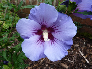
12 By the Dozen: Blue Hibiscus

i don't know if this will appear on the blog but i have cropped you piece here and there and want to put this image forward taking everyone's comments into account.  now to see if it will appear on the blog in the right place!

Website is updated

After all that excitement the website is now up to date.  I have added the latest challenge page and links and images to members' pages.  Please let me know if there are any breaks or mistakes.

I'm just about to update the blog pages as well.

Then it's all system go on that glorious warm red...

Hilary

Sunday 1 December 2013

Collographs
Collograph printing onto rice paper (need to find a tougher paper to allow less colour clumping and retain the luminosity)

Vessel collograph onto Mulberry paper

Fabric and  altered pumice gel give a textured surface that is the perfect height for relief prints. Cotton prints well with manual pressure.

Cloth printed from a pumice gel printing plate can give a nice grainy texture to add colour and embellishment with all kinds of possibilities.
 Drawing into the pumice gel with a stick can produce subtle imagery in print onto a fine cotton.
 

Morning Glories

Trying to find just the right hue of periwinkle for this project was challenging. While I was running one morning, I noticed a large blooming vine of Morning Glories draped over a fence...immediately, I knew that would be my focus...now to translate it to a textile piece. The background is composed of three different pieces of hand dyed cheesecloth that I "felted" onto black batting. Then I layered on the flowers, stems and purple fibers by more felting with my felting machine. The quilting is done with a wool thread for added dimensions and movement.

Saturday 30 November 2013

Periwinkle

As you all know, the color scheme of my daughters wedding, almost four months ago, was eggplant.  When it came to printing the invitations, the eggplant colored ink was not quite the look we wanted.  After a discussions with the printer she said, 'Let us take a look at some periwinkle inks, I am sure they will work!'  And one of them did!
When the color for this challenge was suggested, I was so excited!


A seemingly simple looking piece but nevertheless it gave me quite a bit of trouble.  Getting the image photocopied onto the fabric was very tricky.  The color of the print continued to show up as blue irrespective of the settings or the fabric or the photocopier that I used.  When I found a method that would give me the correct color, the wording was so faint one could hardly read it. I photocopied it onto voile and  tissue paper with the hope of using a medium in some way to get it onto the fabric; I also tried an image transfer technique but none were satisfactory.  
When I came to the end of quilting the monogram on the center of the invitation on my first two attempts I couldn't get the beginning and the end of my quilting stitches to meet.  Basting did not help as everything came to a point in the center.  I then gave up the idea of free motion quilting, put on the walking foot and managed to do it that way.
I eventually photocopied the invitation onto a cotton with a satin finish and bordered  it with a beautiful periwinkle colored silk fabric, I quilted it very simply.
I am now working on green which is also following along in the theme of the wedding.  So depending on the next color drawn , I may have a theme for this series.

View from the pool


When Marion and I went to Houston in early November, we stayed at the Hilton for the first time. It was fantastic to be in the same building as the festival. What a revelation! One of the best parts for me was the rooftop pool. As I swam early in the morning and watched the sun come up, turning the sky from black to purple to violet to periwinkle, I knew I had found my subject for this challenge. I got my camera and lay on the pool deck to capture the view. Voila!

And the next colour is ....

Well actually I don't know what names to give these colours but I love the way the red background ooches into the orangy red in the middle and then there's that pinky glow bottom right.


Let's call it warm red and see where that takes us!

Blue Hibiscus

A really challenging colour, Linda F!  I went through several design possibilities (and if I was better organised time-wise, I would have a go at them).  But here is my offering.


It is loosely based on the photo.  The hardest part was finding THAT blue.  Here is where I confess that I had some lilac netting that I was going to lay over the blue background before I fused the shapes down.  It got pushed aside - and I forgot!  Groan...  The shapes are fused down and outline stitched.  Free machined leaves and background and puff paint stamens.  These are fun to do.  Should I put another circle on the right?  Edges satin stitched.

Hilary
DANCING MOONS

I found the right colour from Amafu hand dyes here in South Africa when we were at the IQC Africa held recently.  Just had to think of a design which worked for me at the time.  I was working on a piece for our Textile Art Group Gauteng (TAGG) Exhibition (which I sold) and loved the ribbon design and so incorporated it into this piece, although the pieces themselves are completely different.   The colour in the photograph does not show up as well as I had hoped but in "real life" it was good.  This was a difficult colour to find/dye but was a great challenge.  I acknowledge this colour challenge is not easy, but saying that, it is a challenge nevertheless which is good.  I am finding the size more difficult than the colour but again, a challenge, which is really good as it does stretch one and pushes one out of our comfort zone.  I have used a commercial fabric for the moons and the rest are various shades of the periwinkle blue.  My design is appliqued and quilted.


Patricia Blue!

I read in amusement all the concerns about achieving the 'correct' blue in this challenge, knowing I would be faced with the same problem but in thread.  I have also battled to achieve the correct hues in the photograph , but here goes .....................


My butterfly is the Patricia Blue or Lepidochrysops patricia.  The butterfly is free motion embroidery on a transferred photo (using TAP) , cut out, and then fused and stitched onto the background cloth  which has been machine quilted.  I will change the binding as it has 'cropped' the branches which is annoying me.  I suppose I could paint them in?

Berkhamsted #2


Berkhamsted #2
I was inspired by a photo taken in Berkhamsted, on my way to visit Linda Forey this past summer. What a great holiday that was for me, visiting my cousins in Berkhamsted and Oxford, spending eight days in London, then getting together with Hilary, Dianne and Linda F. to attend the Festival of Quilts. Even got to meet Linda B!

original photo
Hand-dyeing to achieve a very specific colour was challenging for me, and it was on my sixth attempt that I finally got what I wanted. But I was able to use fabric from the earlier attempts to make the two buildings in the foreground. The building in the background and the sky are closest to the assigned colour. 

I spent some time studying how various artists used the colour, and how they paired it with other colours, and I found that very instructive. And I grew to love periwinkle!

Lilac lines

I never imagined when I picked this colour how difficult it was going to be to reproduce it in fabric. My approach, after having seen how hard Heather found it to dye fabrics to the right colour, was to buy a number of commercial fabrics in a tight value range.  Looking back at my previous two responses I realised that thin lines were a factor in both, so I decided to continue this theme.  Hope you all like it.

I tried a new method of edging this quiltlet, a double layer of organza pulled round to the back.  I think this has distinct possibilities, but this first attempt was not really neat enough for my liking. What is ice is that it secures the raw edge, and yet still allows the pattern to be seen right to the edge of the piece.

Rainbow Bridge

This mosaic is of our dog, Baxter who died last December. The title 'Rainbow Bridge' is a verse by an unknown author about bereaved pets brought to my attention by a client when I was auditioning the background fabrics. The auditioning was shown to my quilting group and Helena had the same feeling with this chosen fabric so it was the clear winner. The background fabric does not show well here as it is a gradation from white to charcoal.
I used 3 commercial fabrics all of which had segments of Linda's chosen colour. Steam a seam was applied to each fabric and randomly sliced with the rotary cutter into small bits and applied onto the solid dark blue background with tweezers.
I really like the finishing technique. The backing has a seam with an opening for turning. The backing and front are sewn right sides together around all sides and turned throught the opening in the backing.

Illusive Blue Challenge


What a great colour this turned out to be. Now that I have been looking for it, this illusive blue can be found working its magic in many ways, pulling luminosity out of the most somber shadows or creating dimension. A hard working colour in small quantities, that I am glad to rediscover.

 It helped to continue a series of  collograph monoprints, from last summer,  and to finish a second series of woven landscapes using my embellishing machine. I am starting to enjoy working with the colour themes more with each colour so bring on the next one!!! 


Not Quite Periwinkle

Three scheduled posts already - it's a bit like Christmas, the temptation to peek is huge but I know that the wait will be worth it!

I'm sorry for the NQP of the title but I had so much fun doing this! Auditioning fabric in terms of colour and placement is one of the most enjoyable parts of quilt making for me so I don't know why I haven't used collage before. You can tell that this is a first for me because of the quality of the technique - I suddenly seemed to have eight fingers on each hand all of which were getting in the way as I stitched.

I had chosen some fabric which when put together reminded me of a trip, many years ago, to Denmark and I moved on from there .....


I should add that what look like staples at the top of this piece is a line of stitch which happened to catch the flash of the camera!

Salt Cones

On our latest trip we visited the Atacama desert and the salt flats of Uyuni in Bolivia.  This salt lake is about the size of Belgium.  Salt cones are scraped up and left to dry before being trucked off to be cleaned and marketed.  There is residual water that surrounds the cones and at sunset the colours are quite brilliant, both in the sky and on the ground.

and the real thing.

Wednesday 27 November 2013

Next colour!

After an exhaustive random process (Mick picked a number) the person to decide the next colour for our challenge is................

Linda Bilsborrow

Have fun!

Friday 8 November 2013

That perfect colour

I am so impressed with Heather's attempt's to obtain the right colour. I think for the next round we should commission her to dye enough fabric for all of us!!!!
But that's just my way of deflecting attention from my confession - I have strayed away from the original colour palette. Linda's flower reminded me of events from the past that I wanted to capture and in an attempt to avoid a pictorial representation I decided that I would create a collage. In auditioning additional fabrics I moved on from my original selection. So whilst I was very much inspired by the original there is not a lot of connection with my finished piece!

Capturing the Elusive Periwinkle


It worked! I went back to the dyeing table, and I repeated the same ratio (1 part Boysenberry to 3 parts Turquoise) but this time with very hot water. The turquoise stuck around through the "fixing" process and the result is a really good match.

It's so perplexing, Helena. Your instructor, Ann Johnston, told you to stay away from Turquoise. When I took Elizabeth Barton's course, Dyeing to Design, she specified Turquoise as one of the six primary colours we were to use to create all other colours. It was to be used with the two other cool primaries, Fuchsia and Lemon Yellow.

Time to move on, I guess?


Thursday 7 November 2013

My beautiful obsession

Okay, okay, I realize I have been a little relentless about my pursuit of the "elusive periwinkle".

Here are my latest results. I promise to drop the whole thing now. But I am by no means satisfied, and I'm wondering if those of you with more experience with dyeing might have some insight into this.

The cloth with the splotches was my experiment, mixing up various proportions of boysenberry and turquoise and applying it to white cotton with a paintbrush. The ratio I settled on, the column of splotches in the centre of the photo, was 1 part boysenberry to 3 parts turquoise. You can see how the turquoise migrated away from the boysenberry.

The nicely pressed and folded results are nowhere near as blue as they should have been. In fact they pretty much look like pure boysenberry. Is this because I didn't use extra hot water (125 degrees), which is recommended for turquoise? It looked quite blue until I added the soda ash. I am chagrined.

Thursday 31 October 2013

Advice from PRO Chemical & Dye

Vicki Jensen, Lab Manager at PRO Chemical & Dye, has suggested the MX 810 Blue Violet dyed at a 0.25% depth of shade. She added, "If that is too dark, try a 0.1% depth of shade."

You can see my gradation using MX 810 Blue Violet below.  I guess it's just impossible to capture the luminosity of that bloom in cotton!


Blue-violet, standard strength

Wednesday 30 October 2013

Latest dye batch


It's definitely greyer than the colour that Linda has proposed, but I might just go with it anyway. I used 2 parts Ultra Violet and 1 part Indigo. Perhaps there's a little black in the Indigo, and it would have been a brighter result if I'd used a different blue. Linda's colour choice is beautiful, but it's tricky to reproduce! I do think my results match the "Victoria" swatch on Linda B's computer-generated palette.


That Challenging Colour

Eggplant, double strength


Spent much of yesterday dyeing gradations of fat-eighths, trying to match the colour for our next challenge.


Half blue-violet, half indigo,
standard strength


I haven't tried to find the colour in a local shop, because there aren't any local shops to speak of, and because it's such an unusual colour I decided that would be a waste of time.  

Blue-violet, standard strength


No satisfactory results so far, so will have another go at it today. Any ideas? Paint?

Have written e-mail to Pro-Chem with photo of that #@*! blossom. Will let you know if they respond.

Meanwhile, Helena, if you see something promising at Houston, please buy a little for me!


Friday 25 October 2013

Late contribution to the - May 31st 2013 deadline - colour challenge - EGGPLANT!

‘Miniature chupah.’
In this new series using ‘color’ as a subject, I was the one to choose the first color.
I chose ‘eggplant.’
A few weeks later, our daughter became engaged and she chose eggplant as the color scheme for her wedding. 
I made the chupah (bridal canopy) .  I used their monogram which is the Hebrew letter F (Fried is our son in law’s last name) with both of their names in Hebrew within the F.
This is a miniature of the actual chupah. 
Big apologies for the lengthy delay.  
Now onto green............


Sunday 20 October 2013

Busy weekend!

Two vernissages in 48 hours. Here's a photo of Michele and me, taken in front of our side-by-side boards during a quiet moment at the Hudson Artists show.


The vernissage at Stewart Hall was great fun, with opportunities to chat with many of the other 79 artists. It was just too crowded to take any photos, but here's one taken yesterday when the gallery was quiet. That's Helena's "colour explosion" on the far left, and my two Cityscapes on the far right, with Linda Creasey Brown's two urban landscapes in the centre.


As always, the curators of the Stewart Hall show chose well from a wide variety of media, and managed to group the pieces by theme or palette, making for an effective display.

Saturday 12 October 2013

Hudson Artists Fall show

Michele Meredith and Heather Dubreuil are delighted to show their work at the annual Fall show of the Hudson Artists. More than 30 artists will be represented, and about 200 works in various media will be on display. Unframed work and greeting cards will also be available. A lovely watercolour painting by Ginette Parizeau will be raffled off in support of NOVA, a local home-nursing charity, and a tea room will be available to welcome visitors.

If you're in the area, we hope you will join us. We'll both be at the vernissage on Friday evening, and staffing the sales desk on Sunday morning.


Yay! Three members in Stewart Hall show


Every fall, Stewart Hall in Pointe-Claire puts out a call to Montreal-area artists, asking for works in a variety of media to include in their art rental collection. The standard of work chosen is always impressive, and the show always well worth a visit.

This year Heather Dubreuil, Michele Meredith and Helena Scheffer were pleased to have pieces juried into the show.  Their work will be on display in Stewart Hall's beautiful, brick-walled gallery from October 19 to December 1, 2013. Afterwards, the art will be available for rental for one year through the Art Rental and Sale Service.

The vernissage for the show is on Sunday, October 20, at 2 pm, 176 Lakeshore Road, Pointe-Claire QC.

Gallery hours are Monday through Sunday 1 pm to 5 pm and Wednesday 1 pm to 9 pm.

Tuesday 1 October 2013

Green Bowl

Too bad this can't count as a 'green' piece because the colour is so close.  I thought you'd like to see what I have been doing this afternoon.  The material is called eyelash fabric and unfortunately the shop only had silver, gold, red and green (could Christmas be around the corner?!).  My local craft centre is holding an exhibition early next year for visually impaired visitors - called Tactile Textures.  I have submitted my Braille quilt and also some coiled baskets made of different ropes, cords, and fabrics.  I hope this one will be accepted because it has a lovely delicate tickling feel...


The fabric is on the right - but look what a treasure trove of sparkly green bits you get from cutting strips!  You can imagine they are stuck to me, the carpet, everywhere I go I seem to be leaving a trail of green eyelashes!

Hilary

Sunday 29 September 2013

Congrats Helena and Marion

Congrats to Helena and Marion who have their piece, Origins, featured in the latest SAQA Journal (page 29).  It is in the chapter, Art quilts shine in Quilts, Inc. collection by Sandra Sider.  She says of the piece: 

"Helena Scheffer and Marion Perault created Origins (2006) using a collage process and
fusing appliquéd fabric.The central panel is an over-dyed vintage damask tablecloth.
Other fabrics include vintage silks and men’s shirting. The design includes spirals that
extend into space, symbolizing the potential of new beginnings."
 
Well deserved.

Hilary


Tuesday 24 September 2013

Hudson & Region Studio Tour

Water Tower #1, Heather Dubreuil


Michele Meredith and Heather Dubreuil are delighted to participate in this weekend's Hudson Studio Tour, as it marks its tenth anniversary year.

Heather's home and studio will be opened to visitors on Saturday and Sunday, September 28 and 29, 10 a.m. - 4:30 p.m.

Michele will show her intriguing new work, both two- and three-dimensional, at the same address. Both plan to give small demos of their techniques.


Vessel, Michele Meredith


To learn about the other twelve artists and artisans on the tour and how to find their venues, please visit the website.

To mark the tenth anniversary of the Tour, a special blog has opened, featuring profiles of the artists and news of their recent events.

Hot spiced cider will be on hand to welcome visitors. See you there!

Friday 13 September 2013

Wonderful link to a Green fibre exhibit

Thankfully this arrived in my in-box after the deadline for our Green Challenge, or it would have been way too influential on my process. This link was sent to me by our text'art member Lauma, and what a find it is!


Tuesday 10 September 2013

SAQA Auction Fundraiser

Every year, Studio Art Quilt Associates holds an on-line auction of 12" x 12" art quilts. More than 400 quilts were submitted this year, and they have been divided into three lots, with the first lot going on the block today.


The prices start at $750 on Day 1, and then go down a little every day until anything available on Day 6 is priced at $75. The second lot will go on the block next Monday, September 16, and the third lot on Monday the 23rd. Last year, over $60,000 was raised to offset the organization's operating expenses.

I was delighted to have my piece sold within the first two hours of the auction's opening today, priced at $750. It was bought by Nysha Nelson of Tennessee. Nysha is known to buy works by well-known art quilters, so it is a special honour to have him choose my piece. I actually met Nysha when I attended the SAQA conference in Santa Fe last spring, where he bought my donation to the postcard auction.

If you'd like to find out more about the auction, or to view the more than 400 art quilts donated to the event, please visit the auction website.

Monday 2 September 2013

Next Colour

Determined to crack my colour as a theme barrier (I don't think I'll get away with another self portrait!) I turned to my PC. How about this for a breakdown of Linda's wonderful photo:


Blowing my own trumpet

I put something about this on my own blog and Heather suggested that I share it here - which didn't occur to me. I seem to lack the necessary embouchure <G>

A piece that some of you may have seen at FOQ - Transitions:


has gone on to pick up the award for 'use of Colour' at the Harrogate Quilt show this last weekend. Last year I joined with several others to create a group with the intent of exhibiting our work, and this was round one.  We have been meeting together for a year but generally work on our own, nor can everyone make every meeting, so progress is steady but slow.

Sunday 1 September 2013

Before and After Ferns

Helena said she would like to have seen a more mute piece.  Well, here it is without the pink foiling.  I am divided as to whether I was right to add the pink...

Hilary

SOURCE OF INSPIRATION - Green

For some reason I could not find my photo to show my source of inspiration, however, I have now uncovered it.  It was taken on a visit to the village of Tyneham with Hilary and my sister-in-law, Leslie (husbands sister).


I elongated the picture and ignored the flowers .... on revisiting I may add the flowers!

Next colour

And our next colour is......


....the beautiful blue of this Hibiscus.  Enjoy!!
BINGO!!

 Most of the time I "over think" what I want to create for these challenges. When "Green" was announced, I went into my stash and realized that I did not have much green fabric, so I started collecting green fabric. Then I thought that I would do another felted piece and realized that I did not have enough green fibers, so I started collecting a variety of green fibers. As the deadline began to loom, I looked at all of my new green fabrics and my new green fibers but I wasn't inspired. I dug deep into my stash and found this piece of fabric that I over dyed years ago. BINGO!! I had dyed it green with streaks of blue onto commercial fabric that had black dots that gave the impression of flowers and leaves. I could see the leaves in all different colors of green on this wonderful background of green.

As a result, this is a whole cloth quilt. I outlined with black thread around the flowers and the leaves. I thread painted most of the leaves with a variety of threads. The flowers and a few of the leaves are painted with Fabrico pens.


This is the back of the quilt to show the leaves that are thread painted.


Lessons learned from this Challenge:
1. Don't over think...just do it
2. Shopping doesn't always solve the problem
3. Wine helps