 |
| Blue Conical Mountain |
 |
| Blauer Kegelberg 1930 |
I had just read an article in a Danish newspaper about a new exhibition at Louisiana, Museum of Modern Art introducing Gabrielle Münter and decided to go, when Uta announced her choice of artist - what luck. The museum is just a 45 minutes drive from our house and the exhibition was a celebration of her first solo exhibition in 1918 in Copenhagen.
I have chosen the first out of three versions as my piece. I only made one quilt, but I was brave enough to ad markal oil stick, and after that acrylic paint. I don't like version two and three, although version three looks more like the painting, I prefer version ones simpler form.
 |
| With Markal Stick |
 |
| With Markal Stick and Acrylic Paint |
Fused layers, black felt tip pen, quilted and painted.
I have used the fused layers before in various quilts, this example is from 2007 inspired by British watercolour artist Michael Moore.
And black felt tip fen in this Cezanne inspired quilt from 1990
PS. I don't know why I'm coming up as Blogger, rather than Mai-Britt Axelsen, in the e-mails?
PS. I don't know why I'm coming up as Blogger, rather than Mai-Britt Axelsen, in the e-mails?


I do agree with you and prefer version one to the other two. I feel this one is more your own.
ReplyDeleteThe first one is the strongest version in that it has more of you in the execution - it is your take on her piece. I could live with that on my wall as it has a certain calmness about it. Hilary
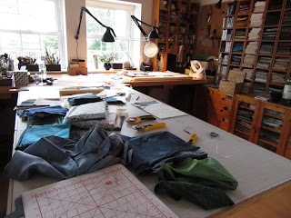
ReplyDeleteI like all three, and the third is so very like the painting! thanks for the studio shots. You are very well organized!
ReplyDeleteWow, Mai-Britt, all three are fabulous. I love the depth of colour you have used - it makes the mountains feel so 'large' and powerful (sorry, I can't think of the right word!)
ReplyDeleteI think your use of a little bit of Markal and acrylic paint is absolutely perfect too. I love all 3.
Your final choice was perfect . Gabriel liked very intense colours and you have shown that successfully in your quilt . This was able to contrast well with the lighter colours in the quilt .
ReplyDeleteI also like your first version. I do admire your perserverence on trying out different techniques until you got to where you wanted it to look. I love the contrasts in colour and your quilting holds it altogether.
ReplyDeleteI prefer the first one too
ReplyDeleteHi Mai-Britt. I like the first one best as it is more simplistic, but the other 2 work very well too. I think the extra effort in making the other 2 was well worth it. I have trouble working in a series but this really shows the value of it.
ReplyDeleteI think the first version looks more like Gabriela's work. Thanks for the progress pictures you have included.
ReplyDeleteNice articles and your information valuable and good articles thank for the sharing information Conical
ReplyDelete