I loved the colour when Colleen announced it and had a couple of ideas in mind but it was a disappointing piece in a lamination workshop that gave me this idea. The gel medium applied in a 'dry brush' style seemed at first a disaster - her eyes hadn't been captured (see below). The face was empty and I was about to bin it when someone suggested I embroider the missing bits back in. I love a challenge. The embroidered details have been designed and digitized in my Bernina software.
I discovered that the additional details needed to be quite subdued colour to avoid standing out starkly - and lining up the embroidery and the image was tricky. I think I need to add a bit more of her hair. It was a conscious decision not to add the pink face paint.
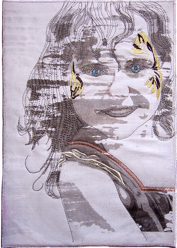 |
| Caitlyn |
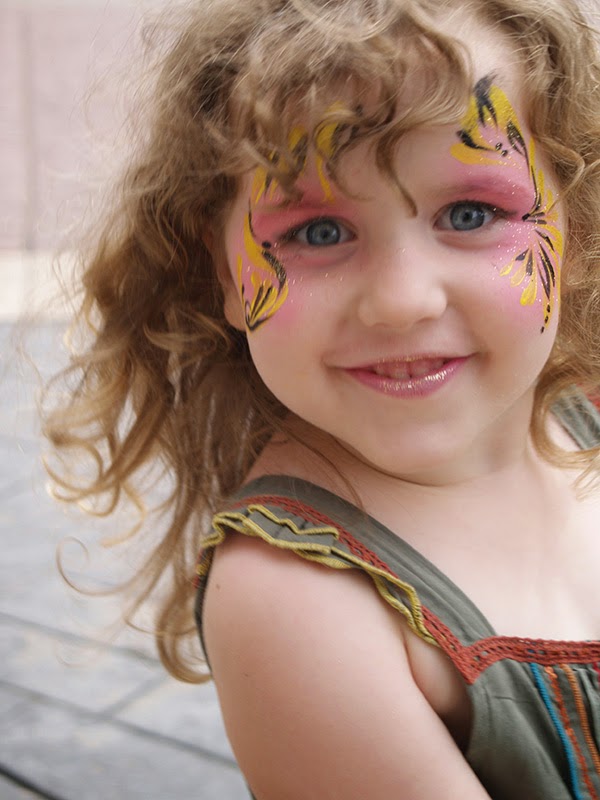 |
| The original photo |
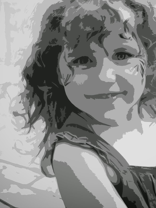 |
| 'Cutout' filter image |
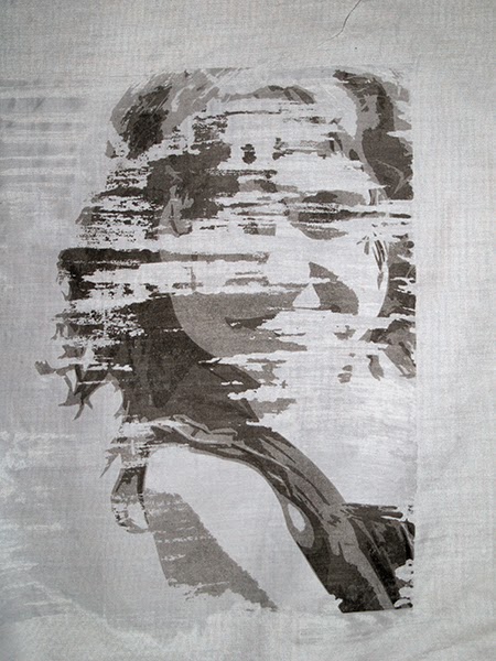 |
| The workshop piece |
Hilary

Isn't it wonderful how, when we try to redeem a disappointing first attempt, our improvisation can create something so unique and unexpected?
ReplyDeleteI loved the way the photograph emerged - what a great idea and very successful too. So often we get rid of half finished pieces that don't seem to work, so this is a lesson for me to keep them and who knows what might evolve. Well done Hilary on perservering in what turns out to be a very successful piece.
ReplyDeleteWish I could see this up close as it is so intriguing in what you have decided to leave in the rough. The technique is a very successful solution and very effective. Just enough detail to her dress and face. There is hint of what this girl could look like in her teens so I suspect she will want to keep this one forever. Well done.
ReplyDeleteWell done, Hilary - you've done just enough to add interest without overwhelming it with detail. It's lovely. Has Caitlyn seen it yet?
ReplyDeleteI agree with Patricia, we are all to quick to bin those pieces that do not work out. No more! This has worked out beautifullyl, Hilary. I do agree with you that a bit more into the hair will frame her face and give more contrast.
ReplyDeleteYou have put just enough detail in to capture her essence. I sometimes find quilted portrait to look quite disturbing when they are too detail. Yours is just right! Great job and use of our "colour".
ReplyDeleteI too would have binned the first result, I'm so glad you didn't. The few colours on the grey background really suit this piece.
ReplyDeleteI agree with Helena that you have captured her essence without too much detail. It is surprising what can be retrieved from a piece that wasn't originally thought to be successful and which can even send us off exploring new avenues. Perhaps I ought to go and have a look through my bin in my sewing room to see what I can find!
ReplyDeleteVery clever use of the image - I love that you've kept additional colour to the minimum. And what a pretty little girl ....
ReplyDeleteShe's a beautiful, the picture is great and you have an amazing result. The touch of colour is perfect.
ReplyDelete