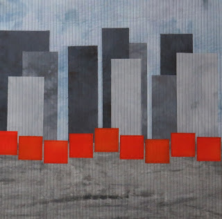
I have been taking an online masterclass with Elizabeth Barton and the November assignment involved using one of her photographs as a jumping off point. I selected the picture of New York City with the Christo banners which were installed in Central Park. So this piece is a bit of a two for one.
Here is the Sheeler that also influenced it.
and this is similar to the EB photo:
and this is my rendition.


Love your interpretation. You certainly have captured the wow with the orange on the grey. A case of less is more works every time.
ReplyDeleteYou nailed it! The architectural, gray rectangles offset with orange squares definitely works for the two original inspirations. Love the simplicity!
ReplyDeleteI do really like your interpretation and you have used the neutrals and graphics so well with the bright red. Your straight lines of quilting add to the overall effect of his graphic design.
ReplyDeleteGreat job with the interpretation and "two for one." I too love the straight lines and graphic design.
ReplyDeleteNice modern interpretation to his work. I like the strong blast of orange against the grey.
ReplyDeleteSplendid piece of work. Very dramatic, and covers the theme well. The colours 'pop' and the quilting really enhances it.
ReplyDeleteI like the simplicity of the design and the sparkle that you achieved with the greys and red contrasting so well . I have come realise with this artist that buildings can make such interesting artwork
ReplyDeleteSo simple but so effective - like the banners themselves, which I would love to have seen in the flesh.
ReplyDeleteLove the rhythm that the buildings and banners have created in this piece.
Perfect. How well the paring back to absolute essentials has paid off. There is music going on in your piece - the buildings playing off the orange squares - a symphony!
ReplyDeleteHilary