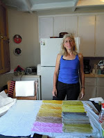

On Day 2, Diane asked us to use some of our coloured tissue to collage a full page, without thinking at all about placement. She gave us a handout showing almost twenty different kinds of successful composition, and we used viewfinders to select portions of our work that worked well as a composition.

 One of my 4-inch squares shows the "pyramid" format, another the "compression" format.

I was then left with a 9-inch square that looked like a "hot mess" to me. With a little guidance from Diane, I added a touch of red here, a touch of white there, to help lead the eye around the whole surface a little better. Maybe it now qualifies as an "Echoing Shapes" or "Shape within a Shape" format.

Another exercise involved applying white gesso to a surface of natural canvas, then collaging tissue onto the dried gesso. Maybe another "Echoing Shapes"?
 On Day 3, we were supposed to make a collage using papers we had made on Day 1, using small, medium and large shapes, all different. I worked from one of my photos. Good points: each corner is different, and the size of the shapes all along the edges are mostly different. However, somehow the focal point (the cat) shifted into the middle, and I have strong black lines bisecting the piece horizontally and vertically. I have concluded, sadly, that there is no saving this composition!
A very stimulating and challenging three days with, I hope, applications to future work.

Composition is not easy and it sounds as though she has given you really good guidelines to look at your work. I'm really looking forward to seeing these up close.
ReplyDeletei am excited by this piece heather. your horizontals and verticals are not exactly center and your cat is certainly off to the right. also there are always exceptions to these rules. your interpretation of this is terrific and i think it is a lovely piece. well done
ReplyDeleteI have to agree with you Pam I think it is very lovely and that you have broken the rule enough to have made it a winner.
ReplyDeleteI am so impressed with what you girls have produced in this workshop. The opportunity to try things out and test theories is so valuable. Sometimes they will work and surprise you and even when they don't the experience is priceless. Luckily I think you can be well chuffed.
ReplyDeleteHilary