I'm sorry - I'm going to be late with this challenge. It's all laid out on my work surface, and the first stage is close to being finished, but the piece isn't going to be finished before the end of play today. I'll post it as soon as I can!

The group blog of five quiltmakers and textile artists scattered around the world in 3 countries and across twocontinents. Our aim is to create a small quilt every three months. The theme is chosen by the members in turn. Our website is: www.12bythedozen.weebly.com
Wednesday, 30 November 2016
SAILS
Here is his painting with my interpretation below:


Silos
Researching Charles Sheeler was very interesting and I love his artwork of buildings, urban settings, and rural settings. His painting of a Grain Bin on the cover of Fortune magazine was the inspiration for my piece titled "Silos".
 I grew up in north central Montana known for its grain crops. We had a wheat farm. The basis of my piece is of a photograph I took of three aging grain silos on our farm. My dad would store his harvested wheat in these grain bins and then wait for a good price in the market place. The large silo on the lower left is of a photograph I took of a very large, rusting silo at a popular home decorating store called Magnolia Farms in Waco, TX. And the large, looming trio of silos in the middle is from a picture my sister took of grain silos in Wall, South Dakota.
 Since Charles Sheeler was also known for his photography, I wanted explore how to digitally enhance my photos. I used various applications to my original photos to intensify color, highlight shapes and create interest . When I was satisfied with the process, I printed each image onto fabric with my printer. I fused the silos onto the background for a collage effect much like many of Charles Sheeler works.
I especially love the diversity of the structure of these grain bins/silos and the architectural lines. If you grew up on a grain farm, this picture definitely brings back memories of hard work and rural living.


I especially love the diversity of the structure of these grain bins/silos and the architectural lines. If you grew up on a grain farm, this picture definitely brings back memories of hard work and rural living.
STILL LIFE - Sheeler
After much oohing & aahing & deliberating the light bulb came on. It took a couple of reads of the 'key ideas' behind his work and eventually I decided I would work along the lines that he often took .... photograph it, craft a drawing based on the original photograph & then use the drawing as a model for the painting. However I went back to the photograph for my painting. I liked the idea of his still life's so this was the journey I took.
 This was my inspiration.
 This was my photograph, however it was in colour as that was my first intention.

This was my drawing. Hilary will recognise this as this was one of my sketches I shared with her (sneaky!). My sketch pad is small so I could not fit the flower in as I wanted the vases to be big enough to play around with.

This is my piece. I reverted to black & white as I wanted to capture the challenge of a B & W photograph. The vases & flower are painted, cut out and fused onto the background which is stamped & painted as a whole cloth. Then I hit a brick wall. How on earth was I going to quilt it ??? I tried using a blind hem stitch with invisible thread on the middle vase which was disastrous as it stuck out like a sore thumb. If you zoom in you probably can see the stitch marks which have proved very difficult to remove thru the paint. The result is the vases & flower are only fused. I have quilted the 'wall' to simulate an embossed wallpaper and the table simple lines.
At the end of it all I have loved doing this challenge & I love my piece.


This was my drawing. Hilary will recognise this as this was one of my sketches I shared with her (sneaky!). My sketch pad is small so I could not fit the flower in as I wanted the vases to be big enough to play around with.

This is my piece. I reverted to black & white as I wanted to capture the challenge of a B & W photograph. The vases & flower are painted, cut out and fused onto the background which is stamped & painted as a whole cloth. Then I hit a brick wall. How on earth was I going to quilt it ??? I tried using a blind hem stitch with invisible thread on the middle vase which was disastrous as it stuck out like a sore thumb. If you zoom in you probably can see the stitch marks which have proved very difficult to remove thru the paint. The result is the vases & flower are only fused. I have quilted the 'wall' to simulate an embossed wallpaper and the table simple lines.
At the end of it all I have loved doing this challenge & I love my piece.
Canadian Parliament
I like the halo appearance in one of Charles Sheeler paintings, the buildings were outlined in a contrasting colour. This approach wasn't successful for me. In light of the world politics this year, not to name anything specifically, I am feeling patriotic. My personal challenge was to work in an analogous colour theme.


New York and Christo
I have been taking an online masterclass with Elizabeth Barton and the November assignment involved using one of her photographs as a jumping off point. I selected the picture of New York City with the Christo banners which were installed in Central Park. So this piece is a bit of a two for one.
Here is the Sheeler that also influenced it.

and this is similar to the EB photo:

and this is my rendition.

Sheeler


(Amoskeag Canal).
This is the photo that I used for his portrait.

Monday, 28 November 2016
Whose turn next??
I've just done a highly scientific draw for who is to pick the next answer, and the result is.......
Phillida!!
Looking forward to seeing who you choose.
Phillida!!
Looking forward to seeing who you choose.
Tuesday, 15 November 2016
Thanks to all
Hello Hilary and fellow Dozens,
I am sorry to announce that it is time for me to retire from the group. I have loved being a member and I thank you all for your wonderful frienship and encouragement. Over the years, I have found it very fulfilling and beneficial because of the talented, warm and generous sharing of ideas and projects of a very high caliber and for what you have all taught me about fibre. Several of the chosen themes went on to be series in my work such as Streetlife and Steps, and the colour series taught me many things about reduced palette(haha) and the necessity of neutrals and where they come from.
Mostly it has been fun to share in the vibrant artistic lives that you all live every day and the support and friendship that is so evident within the group. Sadly it seems with a schedule of moving twice in one year, time constraints have forced me to scale back my commitments and devote the studio time available to my current work. At the moment I have been working very small and for now it is what makes it possible for me to keep working in fibre and to learn and further explore.
I was sorry to miss the trip this summer to meet more of you, but we have just returned from three exceptional exhibitions in Toronto, World Festival of Threads, Mystical Landscapes at the AGO (Monet, Carr Van Gogh,Thom Thompson) and Colleen Heslin and Jack Bush at a Group of Seven Museum set in the woods on the Humber River. All very inspirational for colour and form and finding abstraction in what one might call soulscapes of the imagination.
I so look forward to seeing all of the takes on such an exciting artist as Charles Sheeler( I do love his use of multiple overlays and multiple viewpionts) and will keep in touch through the blog. I will always remember being part of this group. All the best to all of you in your work going forward.
Warmest regards, Michele

I am sorry to announce that it is time for me to retire from the group. I have loved being a member and I thank you all for your wonderful frienship and encouragement. Over the years, I have found it very fulfilling and beneficial because of the talented, warm and generous sharing of ideas and projects of a very high caliber and for what you have all taught me about fibre. Several of the chosen themes went on to be series in my work such as Streetlife and Steps, and the colour series taught me many things about reduced palette(haha) and the necessity of neutrals and where they come from.
Mostly it has been fun to share in the vibrant artistic lives that you all live every day and the support and friendship that is so evident within the group. Sadly it seems with a schedule of moving twice in one year, time constraints have forced me to scale back my commitments and devote the studio time available to my current work. At the moment I have been working very small and for now it is what makes it possible for me to keep working in fibre and to learn and further explore.
I was sorry to miss the trip this summer to meet more of you, but we have just returned from three exceptional exhibitions in Toronto, World Festival of Threads, Mystical Landscapes at the AGO (Monet, Carr Van Gogh,Thom Thompson) and Colleen Heslin and Jack Bush at a Group of Seven Museum set in the woods on the Humber River. All very inspirational for colour and form and finding abstraction in what one might call soulscapes of the imagination.
I so look forward to seeing all of the takes on such an exciting artist as Charles Sheeler( I do love his use of multiple overlays and multiple viewpionts) and will keep in touch through the blog. I will always remember being part of this group. All the best to all of you in your work going forward.
Warmest regards, Michele

Monday, 5 September 2016
Bourrache

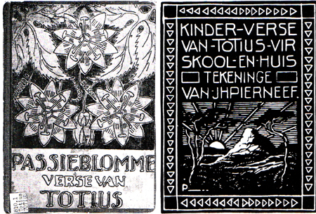
Like many of you, I found Pierneef a very difficult artist to interpret. I have a visceral dislike of his work, the reason for which I find very difficult to understand and had a lot of difficulty in choosing a work. I loathed his paintings on first sight and could not find any that inspired me, so I finally settled on this linocut, which appears to be the cover of a book of children's verse. I prefer the stylized passionflowers to the endless washed out landscapes, trees, and skies of his paintings. I chose to make print blocks from some line drawings of borage flowers from our garden, and printed them in white on black. I was disappointed with the fabric paint I used as it was too liquid and as a consequence the prints are more gray than white.
Friday, 2 September 2016
Corfe Castle as Pierneef might have painted it
As most of you felt, Pierneef was heavily influenced by trees and skies. I was torn between the two and started off with a tree version in mind. However, you can see the sky version won out.


It has been a bit of a journey in that I wrongly started off drawing on the sky colours in one of the paintings which were brooding and dramatic but we have had lovely sunny blue skies down here just recently and out driving one day I had a light-bulb moment that it should be a 'happy' picture - a bit like the posters of the early days of the railways advertising the glories of the seaside. I now have a bag of enough bits of sky for another piece!
Corfe Castle is a ruined castle about 10 miles away and a great favourite with the grandchildren who rush up the hill and clamber all over the fallen stones. It seemed the perfect silhouette for the dramatic sky. My one regret is that I used the wrong colour thread to stitch the pieces of the castle down...
 |
| Sky inspired by this painting. |
 |
Foreground inspired by this painting in that the lines and shapes are simplified.
|
I enjoyed this challenge but honestly had no idea what I was going to do when I choose Pierneef. I realise it has been a real struggle for some of you and I thank you for sticking it out and coming up trumps.
Hilary
Wednesday, 31 August 2016
Pierneefish
Pierneef's obsession of trees was a good starting point along with his subtle painted backgrounds. I painted a satin fabric using Aqua Bricks, love the result! A large tree I photographed while in Hawaii was my reference while thread painting this piece using a variety of 7 threads. I mounted this on a stretched canvas (a first for me).

Subscribe to:
Posts (Atom)