Pages

Saturday, 6 September 2014

Inspired by Chatham Dockyard

For my teaser I posted an image of one of the covered building slips at the Chatham Dockyards built in the nineteenth century. The covered slips really have a cathedral like feel because of the vast roof space. See http://www.thedockyard.co.uk/Dry_Docks__Building_Slips/Building_Slips/building_slips.html for more images
But as I said in my last post it was the contents that inspired this piece. I'm not 'into' naval history but all that metal, the welded joints and the patterns of rivets on the exhibits kept me entranced whilst my other half explored.
As well as being inspired by the colour of the exhibits I also had in mind the working conditions, the heat and the noise in particular, of the boat builders that worked on the iron clad ships:


Monday, 1 September 2014


COBBLESTONES


    I have spent a lot of time in the last three weeks looking  for grey in my surroundings and it has opened my eyes to a colour that I have never really considered before. I found myself looking at pavements and the cracks in between and finally decided to try and replicate the cobblestones outside the mairie. Another pavement  nearby had cushions of almost emerald green moss growing in the cracks and I put the cobblestones and moss together. I sponge  painted a light grey commercial fabric with various shades of grey for the cobbles, using trapunto to make them stand out a little bit more. The moss was made with velvet.

Sunday, 31 August 2014

Message from Pamela

Hi all
We moved house on thurs
I am unable to post to blog from my iPhone All the pieces are magnificent This is an extraordinary bunch of talented women Can't wait to do my piece And i love the next color Helena Love to you all Pam


Pamela Chasen

Caitlyn

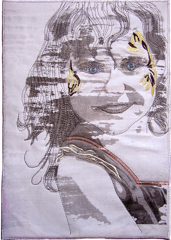
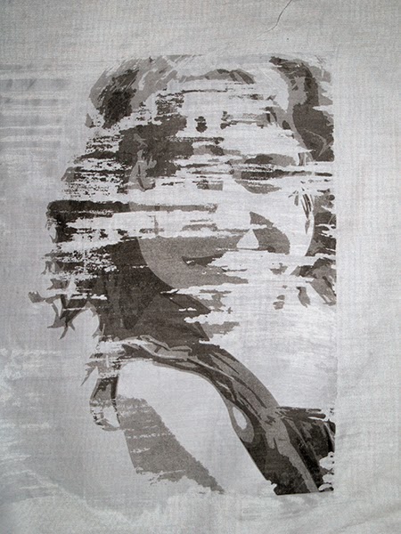
I loved the colour when Colleen announced it and had a couple of ideas in mind but it was a disappointing piece in a lamination workshop that gave me this idea.  The gel medium applied in a 'dry brush' style seemed at first a disaster - her eyes hadn't been captured (see below).  The face was empty and I was about to bin it when someone suggested I embroider the missing bits back in.  I love a challenge.  The embroidered details have been designed and digitized in my Bernina software.

I discovered that the additional details needed to be quite subdued colour to avoid standing out starkly - and lining up the embroidery and the image was tricky.  I think I need to add a bit more of her hair.  It was a conscious decision not to add the pink face paint.

Caitlyn

The original photo

'Cutout' filter image

The workshop piece
 Hilary
RAIN, RAIN GO AWAY

When I first saw the colour, and after printing it out, there were quite a few variations of grey in the sample.  Nevertheless, I was feeling very daunted by the challenge as I don't usually work in grey and am definitately a person who loves bright colours - so I guess the answer is 'combine the two'.  This is a very simple piece with no special techniques but the more I worked on it the more another idea came into my head.  We have a challenge which is to be revealed in November within our local quilt art group.  We have to choose a song title and work around that - watch this space and when the reveal is over I will post it up for you.  It is much bigger, with a lot more interest.  Therefore, on two fronts this has been a great challenge, and fun too!


Storm 1

As I was driving home from the grocery store one day - 3 months ago - I was taken by the black clouds that were building in the sky, and the bright green of the spring time trees below them.  And then I got home to see Colleen's post with the colour grey!  So I knew then what I would do.  I also had in my head the memory of a roadside scene in South Africa of an ominous sky over a golden field. 

So this is the first of a series I think.  The others are still in my head. 


And here in Montreal this morning it is a grey day with rain forecast -  a great day to be sitting here looking at all the great interpretations of the colour.

Jinnie's grey quilt

I have almost finished my quiltlet: I just have to add some 'moss'. We have visitors this afternoon and it might be a struggle for me to post it today, so if I don't manage it , it will definitely be done tomorrow. I found the colour grey to be difficult, never having really considered it before: I much prefer bright saturated colour. However I have always loved the contrast of dark stormy slate grey skies against the various shades of green of the countryside. I tried to use this, but my first attempt ended in the scrap bag: perhaps it will come in useful for something else, but definitely not for this. Then I began to panic, and began to think that I would never come up with anything, until I found inspiration under my feet on wednesday. I painted my fabric on thursday,  did the appliqué on friday and finished quilting and binding it yesterday. With the 'moss' I will be able to use the slate grey and green combination. I am impressed by the quilts that have been posted so far and will add my comments later. A bientôt!

SUNBLEACHED FENCE

I found this colour very interesting.  I went thru my photographs and found quite few possibilities. The one I settled on was a picture that I had taken on holiday at the Berg a couple of years ago. It is of the wooden fence that surrounded the veranda of our cottage. The fence is very old and sun bleached and fitted the challenge.


Here it is !   I photographed the fence onto light lutradur, used Inktense pencils to add some colour to the grey background cloth, placed the Lutradur on top of the three layers and stitched into the Lutradur using the image as a guide.  Once finished I cut the excess Lutradur away and quilted the rest of the piece.


I'm sorry ...

Having posted my teaser, and painted and marked my fabric I managed to construct over half my piece before our Festival of Quilts.  Unfortunately I came away from FoQ with a bad back which I thought would recover with rest but it hasn't so now I'm waiting for a Chiropractor appointment in ... September. I daren't touch my machine in the meantime so until my back is better I'm afraid that machine work is on hold.
My back problem doesn't stop me from getting on with life but there is something about the way that I sit, particularly at my machine, that aggravates it and I've finally learned to err on the cautious side!
I'll be back as soon as my Chiropractor has worked her magic!

Peace

This started as a piece of dyed linen in a class with Leslie Morgan.  The first dyes were spread with a credit card in stripes, and they just kept me thinking about men's pinstripe trousers.  The figures of the men were screen printed on top, using cut pieces of masking tape for the men, which meant my ability to add small details was almost non-existent.

I wanted to try some hand stitching in different yarns, and as I was stitching I found myself thinking about all the bad news currently in the world, and wishing people could ignore their differences and just link hands and live in harmony.  After a few rounds of hand stitching the work was quite lumpy, and so I added some machine stitching to flatten the areas between the men.  Is this one of the possible solutions to the world's problems?; as more 'machines' allow us to communicate more freely via the internet and mobile communications, perhaps we can smooth out the differences between people and achieve a unified whole.

Port Clyde

Port Clyde


Just after our Grey challenge was announced, I was lucky enough to take a one-week holiday, driving down the coast of Maine. Port Clyde is a tiny town at the southernmost tip of a peninsula jutting into the Atlantic, and its claim to fame is as the departure point for the ferry to Monhegan Island, established as an artists’ colony over 100 years ago. Actually, Port Clyde reminded me of Port Wenn, the fictional setting of the Doc Martin series, because of its terrain, its quirky characters, and its fishing culture.


Port Clyde, original photo


When I saw this photo, taken on a very grey day, I knew I had my subject. I especially love the web of wires overhead. 

When playing with the various greys in my stash, I was struck by how the hues become more apparent when the greys are placed next to each other: blue-grey, green-grey, violet-grey, warm grey.

Port Clyde is made of hand-dyes, fused, and machine-stitched with heavy black cotton thread.

Mazelle

Mazelle is a beautiful standard poodle we inherited this spring, she loves watching over her yard. I used an Ultrasuede sample that was made by Spoonflower.com from the picture of her hair. Although the proportion is not correct, I just had to use it.