I have been having a fascinating time looking at white. Is it really white or does it just look white because of its neighbouring colours? Is it the contrast? How much do you need for it to say: the focus of this piece is white!
What would constitute a white piece for me? A piece of white cloth with black lines sketching out something? How about something inspired by Piet Mondrian - lots of white. In the past I have made a piece for the Steps challenge which was white 'snow' (actually a faux chenille technique).
Thank you, Jinnie. I'm not saying this is easy but it has been a pleasure looking for inspiration. And, BTW, I haven't decided on anything yet - typical.
Hilary

The group blog of five quiltmakers and textile artists scattered around the world in 3 countries and across twocontinents. Our aim is to create a small quilt every three months. The theme is chosen by the members in turn. Our website is: www.12bythedozen.weebly.com
Thursday, 16 April 2015
Thursday, 2 April 2015
Santa Cruz de Tenerife
It's been more than a month since Jinnie threw down the gauntlet with her "Lily White" challenge, and I thought I would share with you my first response to the subject. Not to worry: "Santa Cruz de Tenerife" didn't make the cut, and another one is waiting on the sidelines for the official reveal.
For years I have had a photo of Tenerife, torn from a travel magazine, posted on my design wall. I have always loved Mediterranean hillside towns, the way they have developed so organically, adapting to a twist of the road or an outcropping of rock. They look a bit like termite nests, though more picturesque, of course.
"Lily White" is very much a challenge for me, as I find it difficult to work with white. So often in nature, white reflects the colours around it. Nevertheless, I decided this was the Big Moment for the Mediterranean Hillside Town.
I chose a printed cotton, a mottled green-and-brown Stonehenge, to suggest the vegetation and rock that serves as a background to the dwellings, and then blocked in the large white shapes with a facing of white cotton, to minimize show-through of the dark background. Then I cut small squares and rectangles of white, beige, grey, tan and orange to serve as the buildings themselves. The windows are so small they are indicated with ink, and the stitching in grey thread goes all around the small shapes to secure them.
I am happy with this piece, which serves to remind me of a visit to the Canary Islands a few years ago, but have settled on another scene I want to translate into fabric for our 12 by the Dozen challenge. Meanwhile, this will make a nice addition to the dozen cityscapes I have made in this 8.5" x 11" format.
 |
| Santa Cruz de Tenerife |
"Lily White" is very much a challenge for me, as I find it difficult to work with white. So often in nature, white reflects the colours around it. Nevertheless, I decided this was the Big Moment for the Mediterranean Hillside Town.
I chose a printed cotton, a mottled green-and-brown Stonehenge, to suggest the vegetation and rock that serves as a background to the dwellings, and then blocked in the large white shapes with a facing of white cotton, to minimize show-through of the dark background. Then I cut small squares and rectangles of white, beige, grey, tan and orange to serve as the buildings themselves. The windows are so small they are indicated with ink, and the stitching in grey thread goes all around the small shapes to secure them.
I am happy with this piece, which serves to remind me of a visit to the Canary Islands a few years ago, but have settled on another scene I want to translate into fabric for our 12 by the Dozen challenge. Meanwhile, this will make a nice addition to the dozen cityscapes I have made in this 8.5" x 11" format.
Friday, 13 March 2015
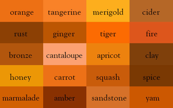
Colour Thesaurus
It's a good job we didn't have this when we began our current round of challenges - http://www.boredpanda.com/color-thesaurus-char-ingrid-sundberg/

Monday, 2 March 2015
Sand
Continuing in the theme of my daughter's wedding, I submit my piece for the colour 'sand.'
A conceptual piece.
.jpg)
A conceptual piece.
Saturday, 28 February 2015

Ammonites

The photograph of the cliffs that Hilary posted when she chose the colour made me think of the cliffs at Lyme Regis and the fossils found there. I decided to 'find' my own fossil ammonites in hand sewn trapunto done on a commercial fabric. I hand quilted it with seeding and added some machine quilted ammonites. The latter should have taken just over an hour to do, but in the end I spent five hours sewing (in the wrong colour), unpicking and resewing it and I thought I would never finish in time, despite having spent two months on it. It was very difficult to photograph: the photo above gives a good idea of the colour and the one below shows the trapunto better.
.JPG)
Sand Challenge


Sands of Mombasa

The colour of the soil in Kenya where we spent a few weeks this December was very red and it seems to have been imprinted on my visual memory. No matter what I produced for the challenge, the colour of sand was never a warm grey or brown or yellow but always a bit pink or rust. I have finally given in and settled on this selection, as it does celebrate a warm neutral as its central theme .The black cotton fabric was discharged using cascade dishwashing liquid and a round brush.
Slightly sandy
Having just finished reading a book on stitch by Helen Parrott it seemed logical to attempt sand ripples for this piece. The first lesson learned was about scale - too many ripples resulted in a near ric-rac effect!
I layered up a piece of lightly rust dyed fabric made during a recent workshop with Alice Fox and used the rust marks to guide my lines of hand stitch. Once the stitching was complete I rollered the surface with acrylic paint in an attempt to achieve more depth.
I'm looking forward to seenow others have interpreted this challenge as I failed miserably to come up with an original response!

TEXTURED ABSTRACT
I must admit I was completely thrown by the colour, but hopefully rose to the challenge! It took me a while to get the creative juices flowing but hopefully got there in the end.
I decided that I would do something completely different and so out of my comfort zone, although to be honest still like 'neat and tidy' which must be in the genes, so how to do something out of the box for me?

I found some hessian and then decided to do a textured design using
different materials in opposition to the rough texture of the hessian. I
used chiffon in the top right which I very unsuccessfully tried to burn
and now wish I had used organza, but by then it was too late. I
covered some of the chiffon with dyed scrim and then made cords and
applied those. Thereafter stitched using varigated thread in sections
and in retrospect wish I had also incorporated hand stitching to marry
the stitching with the concept. However, I am relatively happy with the
result and am glad I tried something different, for me anyway. Perhaps
I will do something else in the future using the same background but
experimenting further with the ideas I have had since finishing it, and
pushing my limits further.
Abstract #1
My sand piece.
Inspired by the colours in the photo plus sea, sky, objects found and lost and, as suggested by a friend, a sail (though I think from the angle the boat is about to capsize!).
I am quite pleased with this piece. Abstract is not my forte and I even got to do some hand sewing.
The organza is rust and tea dyed. The striped fabric was in a pack of small pieces of a lovely variety of coarsely woven fabrics - years old. The slashes are cut from three layers of fabric which have been bonded together using Heat 'n Bond Ultra which gave me a lovely stiff piece to work with. Background is silk. Ribbon and buttons from stash.
Hilary
Inspired by the colours in the photo plus sea, sky, objects found and lost and, as suggested by a friend, a sail (though I think from the angle the boat is about to capsize!).
 |
| Abstract #1 |
The organza is rust and tea dyed. The striped fabric was in a pack of small pieces of a lovely variety of coarsely woven fabrics - years old. The slashes are cut from three layers of fabric which have been bonded together using Heat 'n Bond Ultra which gave me a lovely stiff piece to work with. Background is silk. Ribbon and buttons from stash.
Hilary
Sand = Lucy
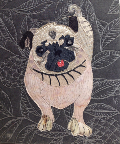
As soon as I saw the challenge colour I knew I had to depict my beloved pug Lucy. Inspired by the incredible found-paper collages of Peter Clark, I attempted to convey her adorableness and loving personality, but I fell short of my aspirations. But no fear, I will try again. This piece is more "cute" than artistic, which is not what I was going for.
And here is the real thing, along with Chloe, my beloved golden/ Collie mix:

Prague: Little Quarter
 |
| Prague: Little Quarter |

Subscribe to:
Posts (Atom)