
The group blog of four quiltmakers and textile artists scattered around the world in 4 countries and across three continents. Our aim is to create a small quilt every three months. The theme is chosen by the members in turn. Our website is: www.12bythedozen.weebly.com
Wednesday, 30 November 2016
Canadian Parliament
I like the halo appearance in one of Charles Sheeler paintings, the buildings were outlined in a contrasting colour. This approach wasn't successful for me. In light of the world politics this year, not to name anything specifically, I am feeling patriotic. My personal challenge was to work in an analogous colour theme.

New York and Christo
I have been taking an online masterclass with Elizabeth Barton and the November assignment involved using one of her photographs as a jumping off point. I selected the picture of New York City with the Christo banners which were installed in Central Park. So this piece is a bit of a two for one.
Here is the Sheeler that also influenced it.

and this is similar to the EB photo:

and this is my rendition.

Sheeler


(Amoskeag Canal).
This is the photo that I used for his portrait.

Monday, 28 November 2016
Whose turn next??
I've just done a highly scientific draw for who is to pick the next answer, and the result is.......
Phillida!!
Looking forward to seeing who you choose.
Phillida!!
Looking forward to seeing who you choose.
Tuesday, 15 November 2016
Thanks to all
Hello Hilary and fellow Dozens,
I am sorry to announce that it is time for me to retire from the group. I have loved being a member and I thank you all for your wonderful frienship and encouragement. Over the years, I have found it very fulfilling and beneficial because of the talented, warm and generous sharing of ideas and projects of a very high caliber and for what you have all taught me about fibre. Several of the chosen themes went on to be series in my work such as Streetlife and Steps, and the colour series taught me many things about reduced palette(haha) and the necessity of neutrals and where they come from.
Mostly it has been fun to share in the vibrant artistic lives that you all live every day and the support and friendship that is so evident within the group. Sadly it seems with a schedule of moving twice in one year, time constraints have forced me to scale back my commitments and devote the studio time available to my current work. At the moment I have been working very small and for now it is what makes it possible for me to keep working in fibre and to learn and further explore.
I was sorry to miss the trip this summer to meet more of you, but we have just returned from three exceptional exhibitions in Toronto, World Festival of Threads, Mystical Landscapes at the AGO (Monet, Carr Van Gogh,Thom Thompson) and Colleen Heslin and Jack Bush at a Group of Seven Museum set in the woods on the Humber River. All very inspirational for colour and form and finding abstraction in what one might call soulscapes of the imagination.
I so look forward to seeing all of the takes on such an exciting artist as Charles Sheeler( I do love his use of multiple overlays and multiple viewpionts) and will keep in touch through the blog. I will always remember being part of this group. All the best to all of you in your work going forward.
Warmest regards, Michele

Monday, 5 September 2016
Bourrache

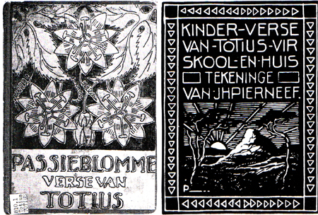
Like many of you, I found Pierneef a very difficult artist to interpret. I have a visceral dislike of his work, the reason for which I find very difficult to understand and had a lot of difficulty in choosing a work. I loathed his paintings on first sight and could not find any that inspired me, so I finally settled on this linocut, which appears to be the cover of a book of children's verse. I prefer the stylized passionflowers to the endless washed out landscapes, trees, and skies of his paintings. I chose to make print blocks from some line drawings of borage flowers from our garden, and printed them in white on black. I was disappointed with the fabric paint I used as it was too liquid and as a consequence the prints are more gray than white.
Friday, 2 September 2016
Corfe Castle as Pierneef might have painted it
As most of you felt, Pierneef was heavily influenced by trees and skies. I was torn between the two and started off with a tree version in mind. However, you can see the sky version won out.


It has been a bit of a journey in that I wrongly started off drawing on the sky colours in one of the paintings which were brooding and dramatic but we have had lovely sunny blue skies down here just recently and out driving one day I had a light-bulb moment that it should be a 'happy' picture - a bit like the posters of the early days of the railways advertising the glories of the seaside. I now have a bag of enough bits of sky for another piece!
Corfe Castle is a ruined castle about 10 miles away and a great favourite with the grandchildren who rush up the hill and clamber all over the fallen stones. It seemed the perfect silhouette for the dramatic sky. My one regret is that I used the wrong colour thread to stitch the pieces of the castle down...
 |
| Sky inspired by this painting. |
 |
Foreground inspired by this painting in that the lines and shapes are simplified.
|
I enjoyed this challenge but honestly had no idea what I was going to do when I choose Pierneef. I realise it has been a real struggle for some of you and I thank you for sticking it out and coming up trumps.
Hilary
Wednesday, 31 August 2016
Pierneefish
Pierneef's obsession of trees was a good starting point along with his subtle painted backgrounds. I painted a satin fabric using Aqua Bricks, love the result! A large tree I photographed while in Hawaii was my reference while thread painting this piece using a variety of 7 threads. I mounted this on a stretched canvas (a first for me).

PIERNEEF
On going through Pierneef images over and over again all I could see were trees and more trees. I must admit his clouds were the one aspect that I thought were really eye-catching. To digress, four of us went off to spend a week in Clarens a really small, very arty village right on the border of Lesotho where they were holding a mini-quilt festival. They have no large supermarkets, no banks, mainly art galleries and restaurants - an artists paradise. While we were there we took a short road trip through the Golden Gate National Park and took a lot of photographs of the very different and beautiful mountain scenery. On returning home I found this piece that Pierneef painted and decided there and then I was not going to do trees, but actually found that amongst the photographs I had taken the mountains were very similar to this piece of his work. I tried to find out where he had painted this piece or what it was called but was not able to establish either so this is the piece I was inspired by below. I did not use his colours but used the colours that are in my photographs, as somehow these seem more realistic/appealing.


Baobab Tree
Was this not a challenge and a half. After a lot of procrastinating I decided to go with a photo of mine as my subject matter which fits in with the artist but would quilt it in the style of some of his paintings. My pic is this one of a Baobab tree taken while we were in Dar es Salaam.


My two Pierneef pics are .....


My piece is the following .......

This is a whole cloth painted with Derwent Intense Inks.Easy dot tool used for the leaves on the tree. Quilted and then I went in with Markal/Shiva sticks to create the shading amongst the quilting. It has not worked as well as I would have liked but it was a risk worth playing with. It also definitely looks a lot softer in real life. In a funny way I actually do like it.
Boxes ticked, but ...
I did my homework, I picked out those elements of Pierneef's work that seemed relevant - his trees, his colours, his reference to maths (OK so I pushed this a bit and used Penrose tiling!) but the end result doesn't appeal at all.
In fulfilling my tick list I failed to achieve a focal point or create some contrast in any of the design elements. I created this piece with my mind, not my heart and it shows!
I seem to be spending way too long reviewing the whole catalogue of works of the selected artist looking for something on which to base my quilt. I'm going to have to find a different approach - how do you work?

PIERNEEF
This was not an easy artist for me to interpret ,despite having lived in SA and studied his art in the past.
I found his colours 'faded' and bland . He definitely placed emphasis on clouds and trees and so I chose a painting of his which enabled me to interpret both these elements . I used colours which I had in my wool collection as i decided to use the free motion quilting technique ,using wool as the thread to be couched .
The background was first painted so that I knew where the clouds would be . I did the wool design on the clouds before appliquéing the mountains and trees and then did FM couching on these .
I am not sure whether I really like the end result .

Subscribe to:
Posts (Atom)