
Bourrache

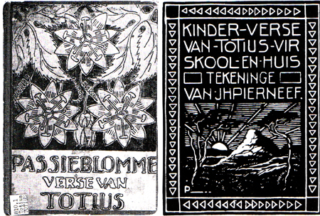
Like many of you, I found Pierneef a very difficult artist to interpret. I have a visceral dislike of his work, the reason for which I find very difficult to understand and had a lot of difficulty in choosing a work. I loathed his paintings on first sight and could not find any that inspired me, so I finally settled on this linocut, which appears to be the cover of a book of children's verse. I prefer the stylized passionflowers to the endless washed out landscapes, trees, and skies of his paintings. I chose to make print blocks from some line drawings of borage flowers from our garden, and printed them in white on black. I was disappointed with the fabric paint I used as it was too liquid and as a consequence the prints are more gray than white.
This comment has been removed by the author.
ReplyDeleteJinnie you were brilliant to discover this gem of Pierneefs and to interpret it so well. While the rest of us were grappling with clouds and trees you were creating beautiful flowers . Well done
ReplyDeleteBy choosing to make your own print blocks, you've given yourself an opportunity to experiment with the same shapes in different compositions and different colours. Could be the start of a whole series!
ReplyDeleteI'm quite pleased with the print blocks and will definitely be experimenting with them further; As you say, maybe another series!
DeleteThis comment has been removed by the author.
ReplyDeleteI admire your honesty. We can't all like all the artists that are chosen which makes this challenge so much harder, as if you can't connect with the artist it makes it that much harder to produce an interpretation / inspiration. I like that you have approached this from a completely different angle and digressing from the trees, clouds, etc. tht one first sees. So well done on creating a new take on this artist, which is both interesting and innovative. Well done
ReplyDeleteI too was drawn to his linocuts and even found that I have somewhere locally I could have had the fabric laser cut for me. But the idea faded. It must have been a terrible challenge trying to connect with his paintings. Hope Sheeler is better for you.
ReplyDeleteI actually like the slightly faded look that the paint gave you.
Hilary
The page that you found with the flowers is like a breath of fresh air after all the landscapes. I like the grayness of your flowers - too white and it might have look garish.
ReplyDeleteGosh you really did your homework. Well done. Love what you have done. I need to up my research in future and also find a hidden gem.
ReplyDelete