Pages

Saturday, 31 May 2014

Apricot /peach challenge


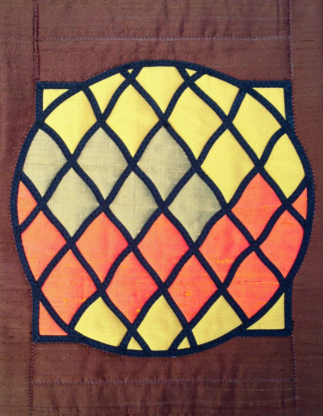
Still working on the theme of my daughter's wedding, I am using a stained glass window of the Sha'ar Hashomayim synagogue, where my daughter got married , as the inspiration for my interpretation of this colour.
Using the stained glass quilting technique (which I have never done), and different colored silk fabrics, I completed this piece according to a demo I found on you tube.
I am thoroughly enjoying my journey backwards from an art quilter to one who is enjoying all these traditional methods and techniques.
PS  following on a suggestion from Colleen, I am posting a photo of my daughter and her husband showing where my inspiration for this piece comes from.
Thanks Colleen!


FRACTURED LEAVES


When the colour was revealed I immediately thought of Autumn (there are a lot of tones in the picture) and although it was at the end of February which is one of our hottest times of the year, I knew that by the end of May we would be in Autumn.  I have had other committments and had to put this on the back burner for a while but when the leaves started dropping from the trees I gathered some of them up, had fun drawing them and then constructing my background.  I thought I would make it more interesting by cutting the leaves up and arranging them differently, but not so that no one could recognise them as leaves!  I had fun, which is what it is all about.


Yellow Challenge

Moondance
This is a continuation of my
 collograph series, taking graphite rubbings onto mulberry paper from a gritty sand gel plate, and adding acrylic colour wash in layers. .Golden yellow seems to be quite a strong colour to use in large quantities but near white and blue it can be glowing and sunny.

With a show deadline looming in August and the garden season upon us I have decided to expand my current series and try to learn what I can from the process using different colour schemes. I have been aiming for more simplicity and possibilities for luminosity.
They continue to take the form of textured streamscapes with podlike vessels, seen from above, travelling in close proximity to each other, sometimes passing into partial shadow.
 I was hoping to achieve a predominance of yellow over blue and I think that this one just squeaks into that category with an addition of light blue to temper the brassiness. 
 Originally I was concerned about the composition being too much in halves, with my strongest yellow breaching the middle and the two elements similar in size, but decided that it reads more like thirds. For next time I will keep any lines from running right to the corner, given the strong diagonal movement and perhaps vary the size of my elements more noticeably.  

INDIAN FLAVOURS!

Living where I do, with the largest population of Indians in SA, we are influenced daily by their culture, fearless use of colour and spicy, perfumed foods.  This colour just cried out "indian".


I have once again used a piece of my break down screen printing fabric (really proving quite useful) as the colours remind me of the marigold lays that are often hung across the doorways to their homes.   At one stage I was quite interested in Mandalas and even tried to challenge myself to create one a week which slowly faded.  This one was stitched and then painted. Finally, I have brought in the rows and rows of pyramids of ground spices that are found on the tables in the markets.  Great colour! Great smells!

Although left to the last minute, I had fun putting this one together.

5 + 1

This is my favourite colour combination: blue and yellow (very Monet).  I have made two pieces.

The fruit bowl
 The first was more of an experiment and it wasn't a total success. 


 The background is a piece of furnishing fabric which I embroidered to create the look of Michele's table cloth.  I also broke the vertical lines to give the impression the bowl was standing on a flat surface.

The fruit is a a piece of hand dyed tea-bag paper given to me by a friend, Sally-Ann.  I tried to add shadow but have only succeeded in making them look like tennis balls - I've just realised they need the odd stalk!!!


So, not entirely happy with this, I decided to abstract the image more and came up with this.

5 + 1
 Simpler, but I like it. The plate is a Java batik bought many moons ago and the background is a piece of 'Michael James' fabric that was brought out by RJR? also many moons ago.  The tea-bag fruit is backed with a yellow fabric as it is slightly transparent.  I played with various random and rigid ways of placing the fruit but settled on this one.  So, this is my offering: 5 + 1.

Hilary

Water Tower #6

The mango yellow colour was just the blast of warm sunshine that we needed here in Montreal's winter, which seemed interminable. Thanks, Michele!
Water Tower #6
This piece was inspired by a photo I took in New York City last year, shown below. The windows in the foreground building are made with variegated thread in a wide satin stitch. The fabrics are hand-dyed and commercial cotton.


Orange Notan


My contribution for this challenge.  I've been taking part in another challenge as well recently, and then at a get-together with fellow quilters we were looking at Notan designs, and I realised I could combine both.  When working in paper you just turn over the pieces to get the expanded image, but that doesn't work with bonding fabric, so I had to make two.  The same happened with my other challenge, so I ended up with 4 related pieces.  Here's the other three images.


Un-named colour

Like a lot of us I began by associating Michele's colour choice with food, probably because I had no fabric that seemed right, quite a few scraps but nothing of a suitable size. Nor could I name the colour to start working on associations!
I kept looking at my spice rack but wasn't getting excited. Then my daughter gave me an Easter egg and I was off! It wasn't a sugar rush but the wrapping that excited me, scraps of fabric, sparkly paper in just the right colour with a bit of gold - what more could I want other than a bit of contrast to make the eye travel.


I thought I'd try some fan quilting for something different - I've done it now, and wouldn't use it as an allover pattern again, but you've got to try these things!

Paperbark Maple AKA "Bark III"


Whenever I don't know what to do with a theme or colour, I seek inspiration in the beautiful book Bark: An Intimate Look at the World’s Trees by Cédric Pollet, which I received as a gift from my friend Debby Kemball. This is my third stab at beautiful tree bark. The Paperbark Maple grows in central China. It is used as an ornamental tree, largely for its bark, which peels in large fragments that roll up like a cinnamon stick.  To create the bark illusion, I used my hand-dyed fabric for our theme colour, and paint
for highlights. The peeled bark was created with starch, an iron, and a wooden spoon handle. 

Lauma's Salad


This piece was inspired by a salad that Lauma made that had spinach, yellow beets, cranberries and almonds.  Unfortunately if I had thought of it at the time I would have taken a picture of the salad itself!

It's all "glued" down and stitched.  But I am thinking that it might translate into a much larger piece.  The yellow fabric was created with fabric paints.  I just kept wetting and painting until I thought I had the right colour. 

Friday, 30 May 2014

Sewable Craft Paper

Here's a sneak peek at the product I used for my piece.

Helena featured artist at Quebec Provincial Quilt show

Since you mentioned that it has been quiet on the blog, Hilary, I figured it was a good chance to blow my own horn. I was very honoured to be asked to be the guest artist at the biennial provincial show. Here are some (not very clear) photos that Marion took when we set up last weekend. I will be there this weekend to give 2 artist gallery talks and will try to take more photos of the final set-up and people gathered round.

 Notice the 12btd on the left..... "Acanthus" on the right is a collaboration with Marion Perrault
The orange (Vitamin C) is a collaboration with Marion Perrault.