You may notice that I have had to make a few changes to the blog layout as we had reached the 10 maximum pages on the right under Challenges. You learn something every day - I found an app for stand-alone pages. Series One and the Home page buttons are now separate pages in a tool bar under the title. The problem under Challenges will rear its head again after the next challenge. Time to work on that...
The White Challenge has been added to the website - please check I haven't made any mistakes or missed any links.
Pamela - Happy Landings! Hope you find your way around all those packing crates before too long. We're all very happy you are able to settle and make a home again.
Hilary

The group blog of four quiltmakers and textile artists scattered around the world in 4 countries and across three continents. Our aim is to create a small quilt every three months. The theme is chosen by the members in turn. Our website is: www.12bythedozen.weebly.com
Monday, 1 June 2015

Sunday, 31 May 2015
The next round!
I had been wondering about suggesting this idea when Hilary's Nicholson piece confirmed that it can work so here is something to consider for our next round - how about we each suggest an artwork, 2D or 3D, to use as a starting point?
White ferns
Phew, managed to get my piece finished, and it's still the 31st!
After nearly three months in New Zealand, followed by a nasty virus for two weeks, then two weeks in France, followed by a pair of blocked ears and a bad back, I haven't had the inclination to do any sewing for a long while. This challenge was a good push to get me back to creating.
I wanted to use some of the images I had got from NZ, particularly the ferns. All sorts of ferns grew wherever we went , and I built up quite a library of photographs of them. For this piece I started with a piece of silk, sort of white coloured (in the right light it looks gold and white, but normally it just seems to look rather sandy), then used the simplified image of an uncurling tree fern tendril. I added some crayon to give it a bit of depth, then decided the whole piece was too pale. I took another of my ferns and used a technique I had wanted to try for a while - stitching a shape then painting inside it. Using this method I added more ferns around the edge of the tree fern, then closely quilted between the ferns using a deliberately wobbly 'straight' stitch. Finally I felt a normal binding would too too heavy, so added a simple edging using a piece of frayed white silk, simply stitched over the edge.
 I don't think the photo shows the colours well, but the light was fading when I took the photo this evening. On the whole I am pleased with it, and also very thankful I've started sewing again.
After nearly three months in New Zealand, followed by a nasty virus for two weeks, then two weeks in France, followed by a pair of blocked ears and a bad back, I haven't had the inclination to do any sewing for a long while. This challenge was a good push to get me back to creating.
I wanted to use some of the images I had got from NZ, particularly the ferns. All sorts of ferns grew wherever we went , and I built up quite a library of photographs of them. For this piece I started with a piece of silk, sort of white coloured (in the right light it looks gold and white, but normally it just seems to look rather sandy), then used the simplified image of an uncurling tree fern tendril. I added some crayon to give it a bit of depth, then decided the whole piece was too pale. I took another of my ferns and used a technique I had wanted to try for a while - stitching a shape then painting inside it. Using this method I added more ferns around the edge of the tree fern, then closely quilted between the ferns using a deliberately wobbly 'straight' stitch. Finally I felt a normal binding would too too heavy, so added a simple edging using a piece of frayed white silk, simply stitched over the edge.

EXPERIMENT IN WHITE

When I chose this colour I had no idea what I was going to do. It was a last minute choice as I realized that the colour that I had originally chosen was too close to one that had been done before I joined the group. Finally I decided to try out an idea that had been lying dusty in the corners of my mind. I used to make bobbin lace and had a bagful of twirly threads that had been taken off the bobbins after I had finished pieces of lace. It reminded me of foaming water and for twenty years I have thought of using it for the foam at the bottom of a waterfall. So here is my waterfall made with scraps of white and off-white cottons, man-made fabrics, crystal organza, net and cotton threads. I was quite pleased with it until I added the foam and realised that it is too white, with not enough contrast to make an interesting design, and that it is in fact no more than a sample that could be useful for something in the future. I am glad I finally tried it out though. It was difficult to photograph and does look slightly better in reality than in the photograph.
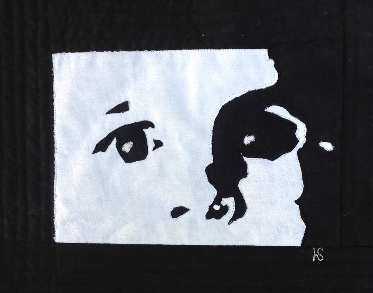
Oscar in black and white

REFRACTION
I had enormous difficulty in dealing with our latest
colour. In Africa
we are bombarded with colour. Wherever
you look it is there everywhere you look,
whether it be in our landscape from the bushveld, the semi-tropical coast in
Kwa-Zulu Natal, or the Cape
Winelands and everything
inbetween. Snow – sometimes in the
mountains but it does not stay long as the sun is sure to be evident within the
next day or so. Everywhere you go
whether it is to the markets with the array of the different peoples of our
land dressed in bright and vivid colour in the latest fashion, African prints,
or the beautiful Indian Sari’s. An
amazing vibrancy in sound and colour, and added to that, the spices in heaps
from Saffron to Red Hot Chilli.
Our light from an artist’s point of view is spectacular and
very different from the light in the Northern climes.
Thanks go to my son, the Engineer, who came up with this
idea for me, and from which comes the title of my piece.
The dictionary definition of a prism is that it is a solid
whose ends are similar, equal and parallel …. a triangular prism of glass or
the like for resolving “white” light into separate colours. This causes light of different colours to be
refracted differently and to leave the prism at different angles, creating an
effect similar to a rainbow. This can be
used to separate a beam of white light into its constituent spectrum of colour.
Therefore without the beam of white light I have used, the
colour would not be visible.
This is a different take on the colour we were given but I
had fun and it did allow me to use the seven colours of the rainbow to
illustrate this idea. After all we are
called “The Rainbow Nation”.

White Challenge

Getting the right white ... Or not!
This challenge was really interesting - I thought that I knew my blue whites from my yellow whites but using those whites in combination with other colours is a completely different thing. It's something I knew about in theory but testing out fabrics proved to be a really good exercise. I thought that I'd succeeded but when I looked at the photograph of this piece I'm having second thoughts. I shouldn't have left the photography until the last minute, I'm dependent on the weather for my light and we are currently going through a particularly dull spell here!

I can't explain this piece, it just happened. My starting point was the idea of using two colour blocks, the white and the yellow, the rest just grew around those two pieces of fabric!
The White Saucer
I have an ongoing admiration for the art of Ben Nicholson and at first I thought of revisiting my earlier homage to his plain white pieces with circles and squares/rectangles. My piece below is a whole cloth and 8" square. I was experimenting with trying to achieve the impression of the different layers by how spaced my stitching was. The strange thing is that the camera turns the layers round: the stitched areas are 'lower' than the unstitched area. Two more pieces can be seen here
My next idea was a piece where I was going to use white paint on top of a collaged background inspired by another of his pieces. But what I ended up doing is this piece.
It is a mixture of piecing and appliqué. What I learn from his art is mostly composition but also tonal value. There are commercial cottons, hand-dyes and the wonderful grey/white stripy fabric was a gift from a friend, Margaret, and is a printed version of her journeys on the London Underground where she allowed her pen to jiggle along in her notebook between stations. Really quite pleased with this piece.
Hilary
 |
| Homage to Ben Nicholson 01 |
 |
| The White Saucer |
Hilary
Greek Village
 |
| Greek Village, 11 x 8.5 |
I find it difficult to work with white. Perhaps if I used more texture in my work I could make white more interesting. In nature, white often seems to reflect the colours around it, and then when white is shaded it becomes another colour entirely, like blue or violet or grey.
 |
| photo found on-line, unattributed |
I've always loved the jumble of squares, rectangles and triangles presented by densely-packed villages, and when I found this image on the internet, I knew I had my subject.
 |
| Santa Cruz-de-Tenerife, 11 x 8.5 |
My first attempt at meeting the Lily White challenge, shown at left, was completed several weeks ago. Something of a departure from my usual Cityscape, it too was based on a "found" photo. Which do you prefer?
MEMORIES OF ........

Gosh this challenge took a while before I had a light bulb moment. Why memories ..... we had a tree which I do not know the name of (not even sure it was indigenous) which was attacked by ants unbeknown to us which came down the other day .It had very long fragile branches which produced the most amazing show of white flowers every year after it had dropped its leaves. It should have been in bloom now.
The light bulb moment hit me when I was making sheets of wet felting for a friend and I thought ...... make a 'white' sheet for yourself and embellish it with stitchery. I did attach the 'tree' first using a very thick loose stranded cord with my embellisher.
Many hours later .... one very tender top of my middle finger I finished it last night. Finished is the operative word. I will need to leave it for a while and see if it grows on me.
To stitch I laid the felt sheet onto a very thin layer or lutradur (to stabilise and give me a decent work surface) and then backed it with a piece of fabric so it is three layers and stitched all the way thru .... however ... it is a bit of a birds next at the back because of the technique used so once I am satisfied I may just add another back to it.
Fun but definitely the hardest challenge for me.
Subscribe to:
Posts (Atom)