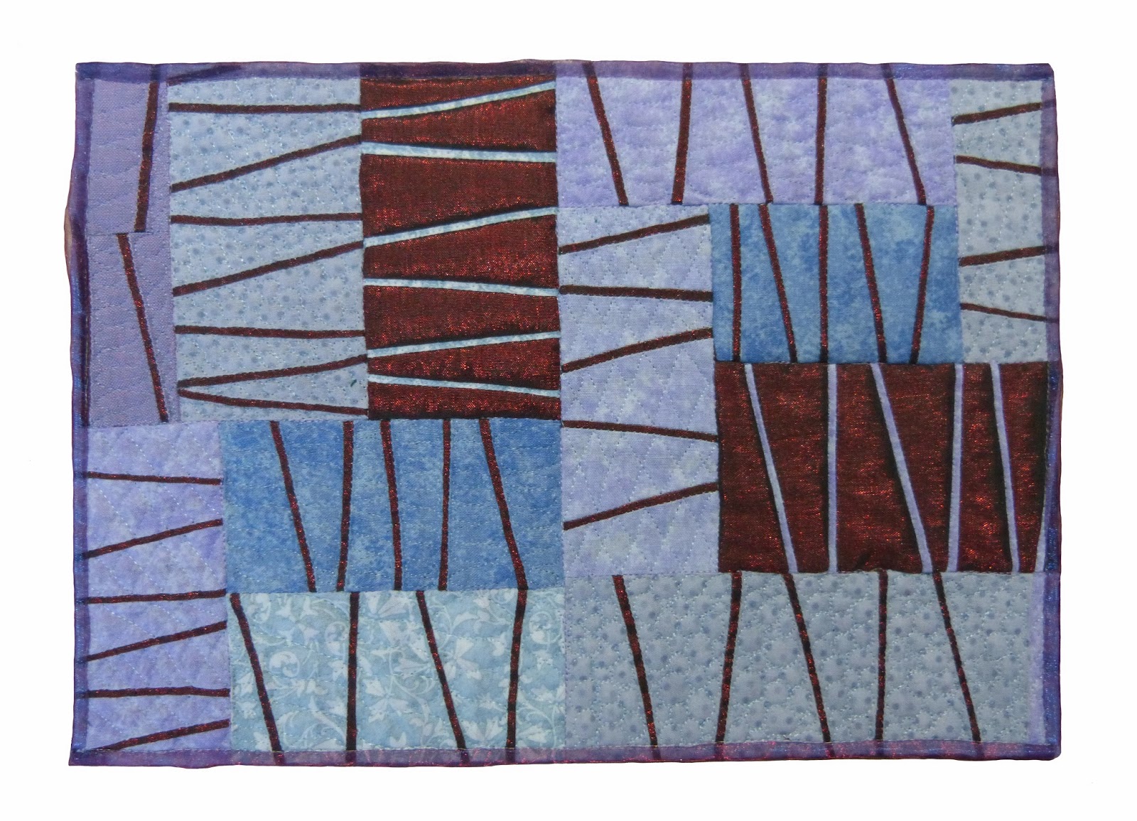
DANCING MOONS
I found the right colour from Amafu hand dyes here in South Africa when we were at the IQC Africa held recently. Just had to think of a design which worked for me at the time. I was working on a piece for our Textile Art Group Gauteng (TAGG) Exhibition (which I sold) and loved the ribbon design and so incorporated it into this piece, although the pieces themselves are completely different. The colour in the photograph does not show up as well as I had hoped but in "real life" it was good. This was a difficult colour to find/dye but was a great challenge. I acknowledge this colour challenge is not easy, but saying that, it is a challenge nevertheless which is good. I am finding the size more difficult than the colour but again, a challenge, which is really good as it does stretch one and pushes one out of our comfort zone. I have used a commercial fabric for the moons and the rest are various shades of the periwinkle blue. My design is appliqued and quilted.
Saturday, 30 November 2013
Patricia Blue!
I read in amusement all the concerns about achieving the 'correct' blue in this challenge, knowing I would be faced with the same problem but in thread. I have also battled to achieve the correct hues in the photograph , but here goes .....................
My butterfly is the Patricia Blue or Lepidochrysops patricia. The butterfly is free motion embroidery on a transferred photo (using TAP) , cut out, and then fused and stitched onto the background cloth which has been machine quilted. I will change the binding as it has 'cropped' the branches which is annoying me. I suppose I could paint them in?
Berkhamsted #2
![]() |
| Berkhamsted #2 |
I was inspired by a photo taken in Berkhamsted, on my way to visit Linda Forey this past summer. What a great holiday that was for me, visiting my cousins in Berkhamsted and Oxford, spending eight days in London, then getting together with Hilary, Dianne and Linda F. to attend the Festival of Quilts. Even got to meet Linda B!
![]() |
| original photo |
Hand-dyeing to achieve a very specific colour was challenging for me, and it was on my sixth attempt that I finally got what I wanted. But I was able to use fabric from the earlier attempts to make the two buildings in the foreground. The building in the background and the sky are closest to the assigned colour.
I spent some time studying how various artists used the colour, and how they paired it with other colours, and I found that very instructive. And I grew to love periwinkle!
Lilac lines
I never imagined when I picked this colour how difficult it was going to be to reproduce it in fabric. My approach, after having seen how hard Heather found it to dye fabrics to the right colour, was to buy a number of commercial fabrics in a tight value range. Looking back at my previous two responses I realised that thin lines were a factor in both, so I decided to continue this theme. Hope you all like it.
I tried a new method of edging this quiltlet, a double layer of organza pulled round to the back. I think this has distinct possibilities, but this first attempt was not really neat enough for my liking. What is ice is that it secures the raw edge, and yet still allows the pattern to be seen right to the edge of the piece.
Rainbow Bridge
This mosaic is of our dog, Baxter who died last December. The title 'Rainbow Bridge' is a verse by an unknown author about bereaved pets brought to my attention by a client when I was auditioning the background fabrics. The auditioning was shown to my quilting group and Helena had the same feeling with this chosen fabric so it was the clear winner. The background fabric does not show well here as it is a gradation from white to charcoal.
I used 3 commercial fabrics all of which had segments of Linda's chosen colour. Steam a seam was applied to each fabric and randomly sliced with the rotary cutter into small bits and applied onto the solid dark blue background with tweezers.
I really like the finishing technique. The backing has a seam with an opening for turning. The backing and front are sewn right sides together around all sides and turned throught the opening in the backing.
I used 3 commercial fabrics all of which had segments of Linda's chosen colour. Steam a seam was applied to each fabric and randomly sliced with the rotary cutter into small bits and applied onto the solid dark blue background with tweezers.
I really like the finishing technique. The backing has a seam with an opening for turning. The backing and front are sewn right sides together around all sides and turned throught the opening in the backing.
Illusive Blue Challenge
What a great colour this turned out to be. Now that I have been looking for it, this illusive blue can be found working its magic in many ways, pulling luminosity out of the most somber shadows or creating dimension. A hard working colour in small quantities, that I am glad to rediscover.
It helped to continue a series of collograph monoprints, from last summer, and to finish a second series of woven landscapes using my embellishing machine. I am starting to enjoy working with the colour themes more with each colour so bring on the next one!!!
Not Quite Periwinkle
Three scheduled posts already - it's a bit like Christmas, the temptation to peek is huge but I know that the wait will be worth it!
I'm sorry for the NQP of the title but I had so much fun doing this! Auditioning fabric in terms of colour and placement is one of the most enjoyable parts of quilt making for me so I don't know why I haven't used collage before. You can tell that this is a first for me because of the quality of the technique - I suddenly seemed to have eight fingers on each hand all of which were getting in the way as I stitched.
I had chosen some fabric which when put together reminded me of a trip, many years ago, to Denmark and I moved on from there .....
I should add that what look like staples at the top of this piece is a line of stitch which happened to catch the flash of the camera!
I'm sorry for the NQP of the title but I had so much fun doing this! Auditioning fabric in terms of colour and placement is one of the most enjoyable parts of quilt making for me so I don't know why I haven't used collage before. You can tell that this is a first for me because of the quality of the technique - I suddenly seemed to have eight fingers on each hand all of which were getting in the way as I stitched.
I had chosen some fabric which when put together reminded me of a trip, many years ago, to Denmark and I moved on from there .....
I should add that what look like staples at the top of this piece is a line of stitch which happened to catch the flash of the camera!
Salt Cones
On our latest trip we visited the Atacama desert and the salt flats of Uyuni in Bolivia. This salt lake is about the size of Belgium. Salt cones are scraped up and left to dry before being trucked off to be cleaned and marketed. There is residual water that surrounds the cones and at sunset the colours are quite brilliant, both in the sky and on the ground.
and the real thing.
Wednesday, 27 November 2013
Next colour!
After an exhaustive random process (Mick picked a number) the person to decide the next colour for our challenge is................
Linda Bilsborrow
Have fun!
Linda Bilsborrow
Have fun!
Friday, 8 November 2013
That perfect colour
I am so impressed with Heather's attempt's to obtain the right colour. I think for the next round we should commission her to dye enough fabric for all of us!!!!
But that's just my way of deflecting attention from my confession - I have strayed away from the original colour palette. Linda's flower reminded me of events from the past that I wanted to capture and in an attempt to avoid a pictorial representation I decided that I would create a collage. In auditioning additional fabrics I moved on from my original selection. So whilst I was very much inspired by the original there is not a lot of connection with my finished piece!
Capturing the Elusive Periwinkle

It worked! I went back to the dyeing table, and I repeated the same ratio (1 part Boysenberry to 3 parts Turquoise) but this time with very hot water. The turquoise stuck around through the "fixing" process and the result is a really good match.
It's so perplexing, Helena. Your instructor, Ann Johnston, told you to stay away from Turquoise. When I took Elizabeth Barton's course, Dyeing to Design, she specified Turquoise as one of the six primary colours we were to use to create all other colours. It was to be used with the two other cool primaries, Fuchsia and Lemon Yellow.
Time to move on, I guess?
Thursday, 7 November 2013
My beautiful obsession
Okay, okay, I realize I have been a little relentless about my pursuit of the "elusive periwinkle".Here are my latest results. I promise to drop the whole thing now. But I am by no means satisfied, and I'm wondering if those of you with more experience with dyeing might have some insight into this.
The cloth with the splotches was my experiment, mixing up various proportions of boysenberry and turquoise and applying it to white cotton with a paintbrush. The ratio I settled on, the column of splotches in the centre of the photo, was 1 part boysenberry to 3 parts turquoise. You can see how the turquoise migrated away from the boysenberry.
Subscribe to:
Posts (Atom)